|
One of the consequences of the decennial United States population census is a reapportionment of seats in the U.S. House of Representatives. This map, from The Wall Street Journal, shows the expected gains and losses of House seats, by state. (from www.wsj.com/articles/lawmakers-prepare-for-battles-over-congressional-redistricting-11609151400)
0 Comments
This interactive series of maps from Pew Research Center looks at the ethno-demographics of the American electorate, by state and over time: www.pewresearch.org/2020/09/23/the-changing-racial-and-ethnic-composition-of-the-u-s-electorate/
Following decades of declining birth rates, Japan's population is shrinking, particularly in rural areas. To stimulate rural tourism, many regions have developed "soft cream" (not unlike soft serve ice cream) that features regional flavors, from lavender and matcha to blue honeysuckle and squid ink: www.atlasobscura.com/articles/what-is-soft-cream-japan
One of the questions continually being batted about at present is, "Has China been fudging its COVID-19 numbers?" This provocative article from Foreign Policy, from well before the pandemic, argues that China fudges *all* of its numbers because China's government -- perhaps all authoritarian governments -- rewards not accuracy but politically desirable numbers.
"We don’t know China. Nor, however, do the Chinese — not even the government. We don’t know China because, in ways that have generally not been acknowledged, virtually every piece of information issued from or about the country is unreliable, partial, or distorted. The sheer scale of the country, mixed with a regime of ever-growing censorship and a pervasive paranoia about sharing information, has crippled our ability to know China. Official data is repeatedly smoothed for both propaganda purposes and individual career ambitions. ... GDP growth has long been one of the main criteria used to judge officials’ careers — as a result, the relevant data is warped at every level, since the folk reporting it are the same ones benefitting from it being high. If you add up the GDP figures issued by the provinces, the sum is 10 percent higher than the figure ultimately issued by the national government, which in itself is tweaked to hit politicized targets. Provincial governments have increasingly admitted to this in recent years, but the fakery has been going on for decades. We don’t know the extent of bad loans, routinely concealed by banks. We don’t know the makeup of most Chinese financial assets. ... But what we don’t know goes far beyond just economics. Look at any sector in China and you’ll find distorted or unreported public information; go to the relevant authorities and they’ll generally admit the most shocking practices in private. ... We don’t know the true size of the Chinese population because of the reluctance to register unapproved second children or for the family planning bureau to report that they’d failed to control births. We don’t know where those people are; rural counties are incentivized to overreport population to receive more benefits from higher levels of government, while city districts report lower figures to hit population control targets. Beijing’s official population is 21.7 million; it may really be as high as 30 or 35 million. Tens — perhaps hundreds — of millions of migrants are officially in the countryside but really in the cities. ... We don’t know how good Chinese schools really are because the much-quoted statistics provided by the Program for International Student Assessment (PISA) that placed China first in the world were taken from the study of a small group of elite Shanghai schools. As soon as that was expanded merely to Beijing — another metropolis — and two rich provinces, the results dropped sharply. ... We don’t know the extent of the collapse of rural education. We don’t know the real literacy figures, not least because rural and urban literacy is measured by different standards — a common trick for many figures. ...We don’t know the real crime figures, especially in the cities, which may represent as little as 2.5 percent of the actual total. We don’t know the death toll for the ethnic Uighur insurgency in Xinjiang, where local officials, in the words of one government terrorism expert, 'bend figures as much as during the Great Leap Forward,' nor do we know how many people are currently held in 're-education camps.' (Incidentally, we don’t know how many people died in the Great Leap Forward [1958-62], piled up in village ditches or abandoned on empty grasslands: the 16.5 million once given in official tolls or the 45 million estimated by some historians.) And we don’t know what we don’t know." foreignpolicy.com/2018/03/21/nobody-knows-anything-about-china Across the U.S., at all education levels, white workers on average make more than their black counterparts with similar experience. This map shows the black-white gap in median household (not individual) income by state. In general, the Pacific Northwest shows the smallest gaps with the largest gaps in the Midwest and South. howmuch.net/articles/racial-income-wealth-inequality-us
The COVID Tracking Project is now including data broken out by race/ethnicity. An analysis of the data reveals that in the District of Columbia and the 24 states shown in red on this map, African Americans account for *at least 50% more* COVID-19 deaths than would be proportionate based on the state's African American population. (For instance, in Ohio, African Americans are 12% of the population but 18% of the state's COVID-19 deaths.) The two states with the highest disparity are Kansas and Wisconsin, where African Americans account for just 6% of the population in both states but at least 25% of the COVID-19 deaths in both states. South Dakota and Utah are not shown on this map because they do not report deaths by race, but caseloads in both states, which are reported by race, suggest similarly disproportionate impact on African Americans. (To see the data, visit https://covidtracking.com/race/dashboard.) 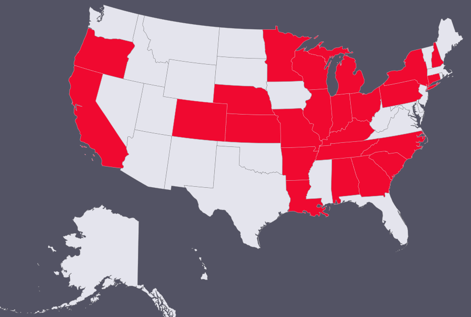 According to U.S. Census data, more than 20% of the U.S. population speaks a language other than English at home. Over the last decade, the fastest-growing major language in the U.S. has been Telugu, a language native to the region of southern India shown in red on this map (which corresponds to the Indian states of Telangana and Andhra Pradesh). The major Telugu-speaking city of Hyderabad is one of India's major technology hubs, and the region sends thousands of engineers and other STEM professionals to work and study in the U.S. every year. (Microsoft CEO Satya Nadella, for example, grew up speaking Telugu in Hyderabad.)
upload.wikimedia.org/wikipedia/commons/thumb/3/3c/Language_region_maps_of_India.svg/480px-Language_region_maps_of_India.svg.png This map from a major health care provider shows the availability of intensive care unit (ICU) beds in the United States, by county. The counties in orange have no ICU beds. The counties in gray have no hospitals (!). The counties that fall into these categories are disproportionately rural and older. The article also addresses the huge variability in the number of ICU beds per resident in those counties that do have some ICU capacity (shown in blue) and has a searchable data table that allows users to compare ICU beds, population, and population age 60+ by county. khn.org/news/as-coronavirus-spreads-widely-millions-of-older-americans-live-in-counties-with-no-icu-beds/
This map, from CityLab, reflects the findings of a new report by a scholar at the Brookings Institution: over the last two years, the number of immigrants living in states and metropolitan areas Donald Trump won in 2016 has increased (shown in shades of blue), whereas the number of immigrants living in states and metropolitan areas Hillary Clinton won in 2016 has declined (shown in red). cdn.theatlantic.com/assets/media/img/posts/2019/10/Map/339f4c2cf.png For more detail about the report's findings, see www.citylab.com/life/2019/10/immigration-where-from-red-blue-state-population-growth-data/599884/
My "10 Weeks in Asia" class is studying Indonesia this week, and I came across this map that underscores the population (and population density) of the Indonesian island of Java (shown in orange): www.wowshack.com/wp-content/uploads/2017/09/JavaCountries.jpg
After 200 years of ballooning human populations, birth rates have fallen significantly in much of the world, with absolute population declines on the horizon for some countries. Although this may be good news on some fronts, as this book review from Foreign Affairs suggests, the economic impact of these demographic shifts should not be underestimated.
"Just as much of the world has come to see rapid population growth as normal and expected, the trends are shifting again, this time into reverse. Most parts of the world are witnessing sharp and sudden contractions in either birthrates or absolute population. The only thing preventing the population in many countries from shrinking more quickly is that death rates are also falling, because people everywhere are living longer. These oscillations are not easy for any society to manage. 'Rapid population acceleration and deceleration send shockwaves around the world wherever they occur and have shaped history in ways that are rarely appreciated,' the demographer Paul Morland writes in The Human Tide, his new history of demographics. ... "Governments worldwide have evolved to meet the challenge of managing more people, not fewer and not older. Capitalism as a system is particularly vulnerable to a world of less population expansion; a significant portion of the economic growth that has driven capitalism over the past several centuries may have been simply a derivative of more people and younger people consuming more stuff. If the world ahead has fewer people, will there be any real economic growth? We are not only unprepared to answer that question; we are not even starting to ask it. ... Capitalism is, essentially, a system that maximizes more—more output, more goods, and more services. That makes sense, given that it evolved coincidentally with a population surge. ... If global population stops expanding and then contracts, capitalism—a system implicitly predicated on ever-burgeoning numbers of people—will likely not be able to thrive in its current form. ... As growth grinds to a halt, people may well start demanding a new and different economic system. Add in the effects of automation and artificial intelligence, which are already making millions of jobs redundant, and the result is likely a future in which capitalism is increasingly passé." www.foreignaffairs.com/reviews/review-essay/2019-08-12/population-bust This map, which appeared in the Wall Street Journal last week, looks at changes in metro area population. The "empty" circles show areas that declined in population from 2017 to 2018. (Look at Illinois, for example.) The green circles show areas that grew in population primarily because of natural growth (e.g., births) or domestic migration (people moving from a different part of the U.S. to those locations). The blue circles show areas that grew in population primarily because of international migration. In aggregate, immigration accounted for 48% of U.S. population growth from 2017 to 2018. www.wsj.com/articles/immigrants-propel-population-growth-in-10-of-u-s-counties-11555560061
A commission in the UK has found that deaths from infections that were previously curable by antibiotics will surpass cancer and be the leading cause of death worldwide by 2050. Although developed countries, including their agricultural sectors, continue to be heavy users of antibiotics, researchers are finding that urban areas of poorer countries are ground zero in the fight against antibiotic resistance, both because of the widespread availability of cheap generics and the prevalence of untreated human waste.
"Antibiotics, the miracle drugs credited with saving tens of millions of lives, have never been more accessible to the world’s poor, thanks in large part to the mass production of generics in China and India. ... Kibera [a poor neighborhood in Nairobi, Kenya] residents are prodigious consumers of antibiotics. One study found that 90 percent of households in Kibera had used antibiotics in the previous year, compared with about 17 percent for the typical American family. ... [U]rban poverty is a huge and largely unappreciated driver of resistance. And so, the rise of resistant microbes is having a disproportionate impact on poor countries, where squalid and crowded living conditions, lax oversight of antibiotic use and a scarcity of affordable medical care are fueling the spread of infections increasingly unresponsive to drugs. ... Sam Kariuki, a researcher at the Kenya Medical Research Institute who has been studying resistance for two decades, said nearly 70 percent of salmonella infections in Kenya had stopped responding to the most widely available antibiotics, up from 45 percent in the early 2000s. Salmonella kills roughly 45,000 Kenyan children every year, or nearly one in three who fall severely ill with it, he said. In the United States, the mortality rate is close to zero." www.nytimes.com/2019/04/07/health/antibiotic-resistance-kenya-drugs.html One of the things students in my "Your Future World" class are often surprised to learn is that in the U.S., as in many other countries, ethnic minorities tend to be clustered in specific geographic areas of the country. This map, based on 2010 U.S. Census data, looks at the geographic distribution of African Americans as a percentage of county population. 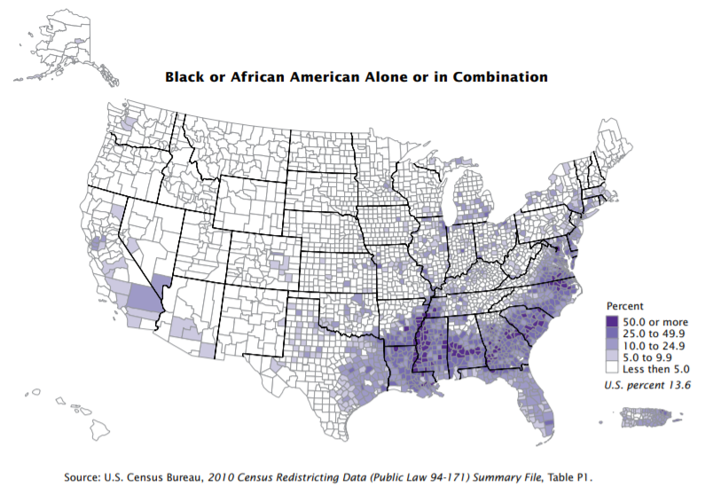 The blue part and the red part of this Reddit map both show 5% of the world's population! i.redd.it/bvik564g0sa21.jpg
With the fate of the "Dreamers" (or beneficiaries of the Deferred Action for Childhood Arrivals program) back in the news, this map shows the geographic distribution of DACA recipients. i1.wp.com/scng-dash.digitalfirstmedia.com/wp-content/uploads/2018/03/daca-states.jpg
According to recently released Census data, in 80% of U.S. states, there are more women than men. This map from Business Insider shows (in red) the states in which males are the majority and (in blue) the states in which females are the majority. amp.businessinsider.com/images/5c006b421a27840a096f111b-1136-852.png
This data-rich GIF from the Pew Research Center shows each state's primary source of immigrants from 1850-2013. www.pewresearch.org/fact-tank/2015/10/07/a-shift-from-germany-to-mexico-for-americas-immigrants/ft_15-09-28_immigationmapsgif/
A government report released last Friday indicates that climate change could cause a 10% decline in U.S. GDP by 2100. But the impact will almost certainly not be felt evenly and will have uneven economic, and political, consequences. This series of maps, from an article published in Science last year, shows probabilistic economic impacts by county. The authors of the Science article note, "Combining impacts across sectors reveals that warming causes a net transfer of value from Southern, Central, and Mid-Atlantic regions toward the Pacific Northwest, the Great Lakes region, and New England. In some counties, median losses exceed 20% of gross county product (GCP), while median gains sometimes exceed 10% of GCP. Because losses are largest in regions that are already poorer on average, climate change tends to increase preexisting inequality in the United States. Nationally averaged effects, used in previous assessments, do not capture this subnational restructuring of the U.S. economy."
science.sciencemag.org/content/sci/356/6345/1362/F2.large.jpg Global population is closing in on 7.7 billion. Middle school and high school students with an interest in population issues are invited to submit an original 60-second video on one of three challenges associated with population growth: protecting human rights, preserving biodiversity, and sustainable resource use. Contest submissions are due by Feb. 28. All the information, including information on prizes, is available at www.worldof7billion.org/student-video-contest/
Is competition over food a flashpoint for future international conflict? This article from Foreign Policy looks at tensions emerging over fishing specifically:
"Humans have always depended on the sea. For as long as there have been fishermen, there have been conflicts over fish. And though it may seem anachronistic, the odds that a squabble over fishing rights could turn into a major armed conflict are rising. The return of great-power competition has actually increased the likelihood of a war over fish. The past 17 years of the fight against terrorism, and Washington’s renewed focus on developing high-end capabilities to prepare for great-power conflict, have led to a lack of preparation for a low-end, seemingly mundane but increasingly likely source of conflict in the world: food. As incomes rise around the world, so too does the demand for food—especially protein. The United Nations currently estimates that between mid-2017 and 2050, the number of humans on Earth will rise by 29 percent, from 7.6 billion to 9.8 billion. Most of that population growth will occur in Asia, Africa, and Latin America—areas where millions of people have recently risen from deep poverty to the middle class. Part of a middle-class lifestyle is a middle-class diet, which includes far more protein than poor people consume. As a result of that shift, the global demand for protein will outpace population growth, increasing between 32 and 78 percent, according to some estimates. ... To maintain political support at home, leaders must ensure access to the high-quality food that is part of a middle-class lifestyle. The supply of both wild and farmed fish will not keep up. ... Scarcity has already forced Chinese fishing fleets further and further afield in search of their catch." foreignpolicy.com/2018/09/12/food-fight-illegal-fishing-conflict Today is Columbus Day, which, while increasingly controversial, is a U.S. federal holiday. Because Italian-Americans have tended to be the biggest supporters of the holiday, today's map highlights (in red) those states that had an Italian-American population of 10% or more in the 2010 Census, ranging from nearly 19% in Rhode Island and Connecticut to 10.7% in New Hampshire. 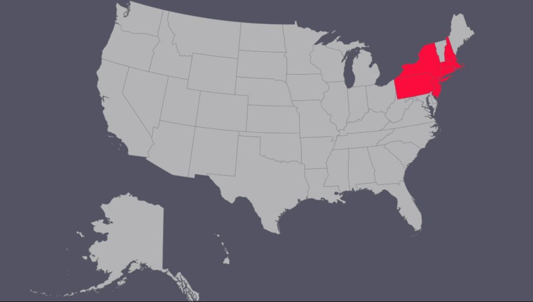 Immigration goes both ways across the U.S.-Mexico border: the map on the lower left shows that Americans are the largest immigrant population in all but four of Mexico's 31 states. The center map shows the source country for each Mexican state's second-largest immigrant community. www.reddit.com/r/MapPorn/comments/99e600/country_of_birth_of_the_2nd_most_common_immigrant/
This map looks at the U.S. by population density. While there may be no real surprises here, it might be an instructive back-to school exercise to see if you (or your kids) can identify the metropolitan areas that show up as red on the map. www.reddit.com/r/MapPorn/comments/9688f9/us_population_per_sq_mile/ or i.redd.it/zzbdivzhhaf11.png
The population density of the European Union is more than 3x the population density of the United States. This map overlays regions of the EU with U.S. states and territories of a similar population. www.reddit.com/r/MapPorn/comments/96gppy/western_european_regions_population_compared_us/
|
Blog sharing news about geography, philosophy, world affairs, and outside-the-box learning
Archives
December 2023
Categories
All
|
 RSS Feed