|
A few months ago, the Chinese Communist party celebrated the 100th anniversary of its founding. This GIF maps the global spread, and decline, of Communism for a slightly different 100-year interval, from 1917 to 2017: www.reddit.com/r/MapPorn/comments/pvx2s5/rise_and_fall_of_communism/
0 Comments
The geo-graphics in this article, including this one, for example (static01.nyt.com/images/2021/09/27/multimedia/27-MORNING-sub2-STATE-VAX-VOTE-PLOT/27-MORNING-sub2-STATE-VAX-VOTE-PLOT-superJumbo.png), highlight the increasingly clear relationship between political geography and COVID vaccination rates and death rates in the U.S.: www.nytimes.com/2021/09/27/briefing/covid-red-states-vaccinations.html
Many of the maps in the news in the U.S. at the moment are redistricting maps, as political parties jostle for position after the 2020 Census. This article from The Washington Post highlights three states and three ways of drawing districts in each, resulting in significantly different political outcomes: www.washingtonpost.com/politics/interactive/2021/redistricting-proposals-oregon-indiana-colorado/ As a bonus: this article from MIT Technology Review looks at how mathematicians are trying to fight gerrymandering with algorithms, including some that even citizens can use: www.technologyreview.com/2021/08/12/1031567/mathematicians-algorithms-stop-gerrymandering.
In most states, this is an off-year in terms of elections. But not in all states. If you are unsure what changes, if any, to voting laws your state may have passed in 2021, this set of interactive maps from the Associated Press can help. (Information accurate through the end of August.) www.wreg.com/news/interactive-maps-illustrate-election-laws-across-the-us/
This geo-graphic looks at who was granted asylum in the U.S. in FY2019, by country of origin, and how that mix has been changing. www.statista.com/chart/25619/asylum-grants-in-the-us-by-nationality
When Kathy Hochul is sworn in as governor of New York tomorrow following the formal resignation of current governor Andrew Cuomo, she will become the first female governor of New York. This topological map from Statista shows which states have had female governors (in blue, NY already listed) as well as the 19 states (in gray) that have not. www.statista.com/chart/25515/number-of-female-governors-by-state
Happy Flag Day! The Brennan Center for Justice reports that between Jan. 1 and May 14 of this year, 14 states enacted new laws designed to expand access to the vote and 14 states enacted new laws to restrict access to the vote. In addition to providing maps for each development, this Brennan Center summary has explanations of the new state laws and notes where state legislature are still moving on voting bills. www.brennancenter.org/our-work/research-reports/voting-laws-roundup-may-2021
Ever wonder what role political borders play in divvying up landmasses? This interesting Reddit map removes everything but the political borders: www.reddit.com/r/MapPorn/comments/l95gc5/map_of_the_world_but_it_is_only_the_land_borders/
As of last week, the 22 states shown in green on this topological map have lifted all COVID restrictions. (The states with the most COVID restrictions? California and New Mexico.) www.statista.com/chart/21423/us-states-lifting-covid-19-restrictions
Shutting off the internet has become an increasingly popular option for asserting governmental control. This geo-graphic looks at the countries in which people began searching for internet workarounds over the last year and indicates what was going on at the time: www.statista.com/chart/24122/vpn-search-during-internet-shutdowns
The anti-corruption NGO Transparency International has released its 2020 Corruption Perceptions Index. The interactive map shows country corruption scores and gives users an opportunity to delve into historical data and analysis. (Spoiler alert: the United States has fallen to 67/100, tied with Chile for 25th least-corrupt country.) www.transparency.org/en/cpi/2020
Urban areas in the U.S. have traditionally been Democratic strongholds. This New York Times analysis of 2020 election data suggests the facts on the ground are more nuanced: immigrant neighborhoods in large cities became more "red" and less "blue" in 2020, not just in easy-to-explain cities like Miami but in a range of cities from Chicago and Philadelphia to NYC and Los Angeles. (Check out the detailed maps in the article itself.) www.nytimes.com/interactive/2020/12/20/us/politics/election-hispanics-asians-voting.html
What makes for far-right violence in the U.S.? Based on the work of a pair of researchers at Oklahoma State, it's not poverty or economic decline (in fact, they find most right-wing extremists are "relatively successful" middle class) and it's not more common in areas with greater ethnic diversity (in fact, they find more right-wing terrorism in U.S. counties that are overwhelmingly white).
Instead, the three factors most predictive of right-wing extremism are: 1. "[D]istrust of mainstream political figures and institutions. This is not the general skepticism of government that is central to Republican ideology, but it is a complete rejection of any legitimate legal authority.... This extreme political cynicism legitimizes the belief that political violence is necessary to defend their rights. It fuels a distrust in elections as a mechanism for settling policy disputes ... [and it] makes people less willing to trust political institutions to constrain their opponents." 2. "[T]he belief in 'white victimhood' or 'aggrieved entitlement.' This is the message promoted on right-wing social media, and emphasizes the victimization of the traditionally dominant White Christian male, with empowered women, minorities and immigrants becoming the villains. ... Despite what many may think, this isn’t a story of economic hardship — it is a fear of lost privilege. Many modern right-wing adherents come from the relatively successful middle class. Indeed, although men are more likely to engage in violence, White middle-class women from the suburbs are one of the fastest-growing groups of believers of QAnon and other right-wing conspiracy theories." 3. "[D]ivisive language — used by politicians to mobilize their base — helps normalize the perception that a group is under threat and violent action is necessary. While violence may not be a politician’s goal, individuals exposed to even 'mild violent metaphors' are more likely to support political violence against opposing groups than those who receive more neutral messages. ... Drawing on data on instances of right-wing attacks from 1970 to 2016, we found that this violence was more likely to happen in counties that were electorally competitive — that is, places where Democratic and Republican votes were roughly equivalent." www.washingtonpost.com/politics/2021/01/09/three-key-factors-that-drive-far-right-political-violence-two-that-dont/ One of the consequences of the decennial United States population census is a reapportionment of seats in the U.S. House of Representatives. This map, from The Wall Street Journal, shows the expected gains and losses of House seats, by state. (from www.wsj.com/articles/lawmakers-prepare-for-battles-over-congressional-redistricting-11609151400)
Both of these maps show, in essence, the proportion of eligible voters who did not vote (shown in beige) in the 2020 (top) and 2016 (bottom) presidential elections. Comparing the two maps shows (a) in more states a greater proportion of eligible voters showed up to vote in 2020 than in 2016 and (b) Wisconsin is the only state in which more eligible voters turned out to vote than didn't in both election cycles *and* between 2016 and 2020 flipped from one party to the other. (from BrilliantMaps.com) i.redd.it/p0z5srsw7py51.png
These cartograms show the results of the U.S. presidential election, based on reported counts as of Nov. 27, as weighted by population (first by county and then by state) and by electoral votes. worldmapper.org/us-presidential-election-2020/
To coax Morocco into normalizing relations with Israel, the U.S. agreed to recognize Morocco's claim to the disputed region of Western Sahara this week. (Previously, the U.S. had not taken a stand on the issue, in keeping with the UN position that the people of Western Sahara, previously Spanish Sahara, should be allowed to vote on governance of the territory.) Although Western Sahara's land is not of particular interest, being mostly desert without significant mineral resources, the waters off Western Sahara may contain oil and gas deposits and, due to the upwelling of the Canary Current, are one of the world's most productive fisheries, to which Morocco has been selling fishing rights. www.worldatlas.com/upload/b7/4b/b0/western-sahara-map.jpg
An analysis of voting patterns in the 2020 presidential election by the Brookings Institution Metropolitan Policy Program finds that Joe Biden won 51.5% of the popular vote, but the counties that voted for him represent 70% of total U.S. economic output as measured by GDP. This economic-political divide represents an increase over 2016 when Hilary Clinton won 51.1% of the popular vote and counties representing 64% of GDP. www.brookings.edu/blog/the-avenue/2020/11/09/biden-voting-counties-equal-70-of-americas-economy-what-does-this-mean-for-the-nations-political-economic-divide/
A cartogram is a map weighted for a particular variable; in this case, the variable is the number of state electoral votes. This cartogram, from National Popular Vote, shows the progress of the National Popular Vote initiative through the state houses (from www.nationalpopularvote.com/state-status). (The National Popular Vote initiative encourages states to pass laws that require their electors to vote for the presidential candidate that won the popular vote in order to ensure that every vote cast in all 50 states is weighted equally. The initiative does not take effect until states totaling at least 270 electoral votes have enacted the necessary law.)
The series of maps in this article from The Washington Post details movement right and left politically between 2016 and 2020 as well as comparing 2012 to 2016. www.washingtonpost.com/graphics/2020/elections/electorate-changes-2016-election-vs-2020/
Is there another map in the news right now? This interactive map from The New York Times is updated regularly to show 2020 election results (tabs for President, Senate, House, and state-by-state with county-level information) including information about outstanding ballot counting: www.nytimes.com/interactive/2020/11/03/us/elections/results-president.html
This map -- produced by Tufts Fletcher School of Law and Diplomacy and based on each state's "status as a swing state, education levels, age, political polarization, left or right leaning news viewership, and trust in news drawn from social media" -- shows each state's vulnerability to electoral misinformation (from foreignpolicy.com/2020/10/20/the-case-against-big-techs-election-strategies)
The urban-rural divide in the 2016 election has been well documented. But can the actual color palette of our landscape predict how we vote? "For his latest undertaking, [Tim Wallace] worked with Krishna Karra, a data visualization engineer, to process imagery of every square meter in the contiguous United States. They asked the question, 'Do people who vote similarly live in similar-looking places?' The resulting article is more museum piece than map, a rich American canvas made mostly of natural greens and urban grays, complemented by less dominant shades of watery blues and arid browns and yellows. ... [V]oting precincts with more gray color — urban developments — were more likely to have voted for Hillary Clinton, while those with greener open spaces, but also sand or rock, were more likely to have supported Donald Trump. Randomly selected precincts with the same color often had a similar political makeup." www.nytimes.com/2020/09/04/insider/journalism-and-geography.html
Today is perhaps the most important overlooked holiday in the United States: Constitution Day. (As history shows, anyone can declare independence; coming up with a stable governing framework is a very different matter.) The U.S. is not the only country with a constitution, though: in fact, nearly every country now has a document they refer to as a constitution. (Notable exceptions: the UK, New Zealand, Israel, and Saudi Arabia.) This map shows the two countries with the oldest constitutions, the two countries with the newest constitutions, the country with the wordiest constitution, and country with the the shortest constitution. Which is which? Answers will be posted later today. ~~~ Oldest ratified constitutions: U.S. (1788) and Norway (1814) Newest ratified constitutions: Thailand (2017) and Cuba (2019) Wordiest constitution: India (146,385 words) Shortest constitution: Monaco (3,814 words) 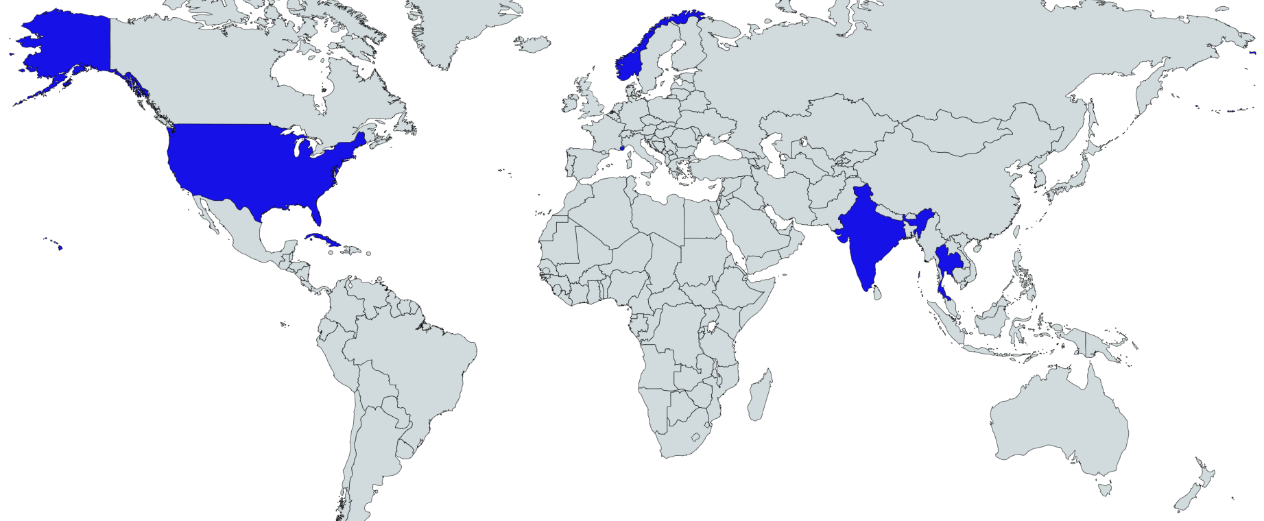 Slate has assembled this state-by-state guide to voting in the November election. "This guide is designed to help Americans vote—and make sure their ballots are actually counted. ... Our chief goal is to recommend the safest, easiest, most reliable voting options in all 50 states and the District of Columbia. We explain how you can vote absentee, from the safety of your own home, then return your ballot without relying on USPS." slate.com/news-and-politics/2020/08/2020-voting-guide.html
|
Blog sharing news about geography, philosophy, world affairs, and outside-the-box learning
Archives
December 2023
Categories
All
|
 RSS Feed