|
How is the COVID vaccine rollout going? This geo-graphic ranks countries leading in vaccines administered as a percentage of the population: www.statista.com/chart/23833/covid-19-vaccination-doses-per-100-people
0 Comments
Need to travel outside the U.S.? This interactive map shows COVID restrictions based on country of origin and destination. For example, at present, a traveler from the United States can go to Colombia, Brazil, Afghanistan, Cameroon, Turkey, and Serbia with relatively few restrictions. www.skyscanner.com/travel-restrictions
Elections and wars are inflection points rich in counterfactuals. The series of maps in this BBC Future article considers alternate histories, which have become a field of serious historical scholarship: what if the U.S. had lost the American Revolution? what if WWII hadn't been fought? what if the states of the United States had splintered in line with some actual proposals? www.bbc.com/future/article/20201104-the-intriguing-maps-that-reveal-alternate-histories
This short looping video from Visual Capitalist compares the continents by land area, population, and GDP: www.visualcapitalist.com/animated-map-the-comparative-might-of-continents/
As the world has passed the milestone of 1 million COVID-19 deaths, this map, based on data from Johns Hopkins University, looks at current COVID hot spots, as measured by new cases per 100,000 people. (from www.npr.org/sections/goatsandsoda/2020/03/30/822491838/coronavirus-world-map-tracking-the-spread-of-the-outbreak)
This geo-graphic shows the toll of COVID-19 on health care workers, by country: www.statista.com/chart/22795/highest-number-of-health-worker-deaths-from-covid
Today is perhaps the most important overlooked holiday in the United States: Constitution Day. (As history shows, anyone can declare independence; coming up with a stable governing framework is a very different matter.) The U.S. is not the only country with a constitution, though: in fact, nearly every country now has a document they refer to as a constitution. (Notable exceptions: the UK, New Zealand, Israel, and Saudi Arabia.) This map shows the two countries with the oldest constitutions, the two countries with the newest constitutions, the country with the wordiest constitution, and country with the the shortest constitution. Which is which? Answers will be posted later today. ~~~ Oldest ratified constitutions: U.S. (1788) and Norway (1814) Newest ratified constitutions: Thailand (2017) and Cuba (2019) Wordiest constitution: India (146,385 words) Shortest constitution: Monaco (3,814 words) 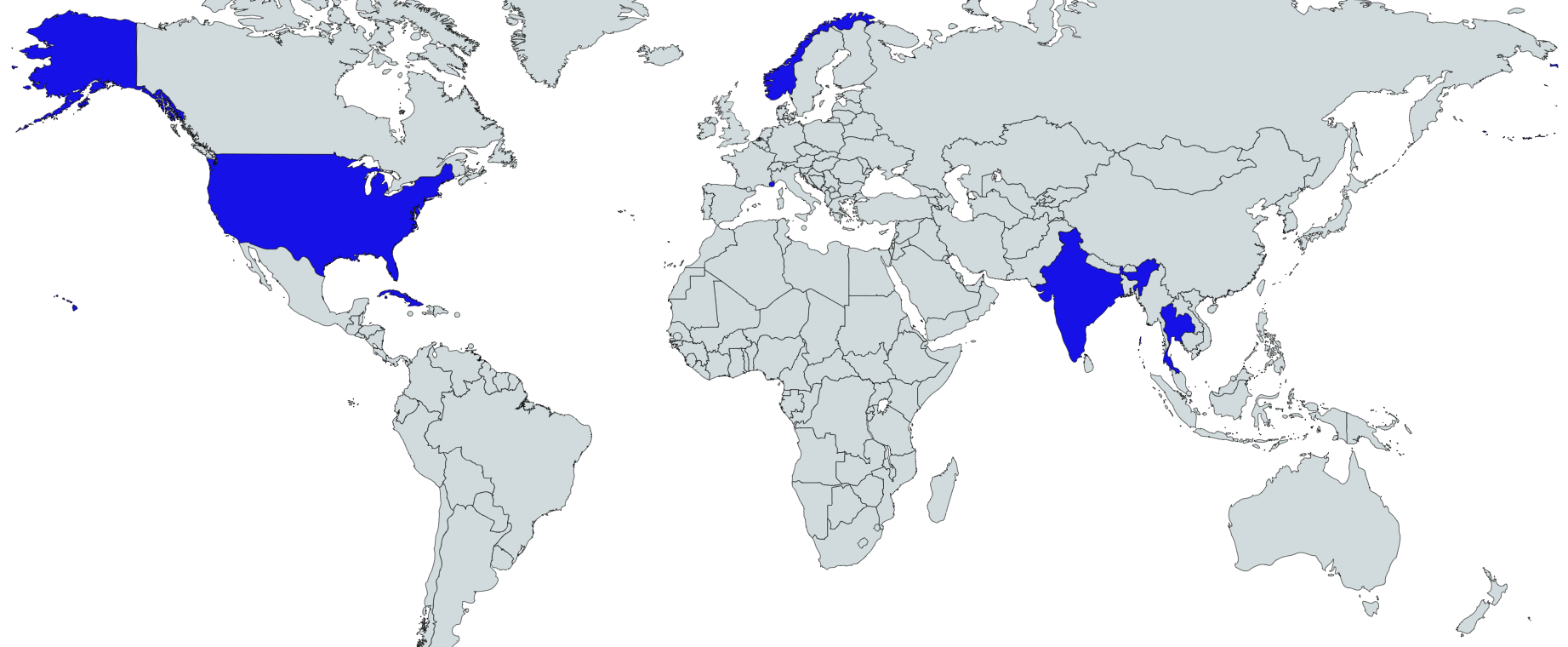 How do people feel about the prospects of receiving a COVID vaccine if available? This geo-graphic, based on a poll of nearly 20,000 adults in 27 countries about a month ago, shows a wide variation: from 97% of adults in China agreeing to receive a vaccine if available to 53% in Russia. In the U.S., 2/3 of adults polled said they would agree to a vaccine. www.ipsos.com/sites/default/files/inline-images/get-a-vaccine-for-covid-19-ipsos.png
This map, based on data compiled by MIT Technology Review, shows which countries have deployed contact-tracing apps in the fight against COVID-19. "The extent to which the apps collect user data varies considerably by country with China's system harvesting everything from citizens' identity, location and online payment history to Germany's Corona-Warn App which complies with Berlin's strict laws on privacy." www.statista.com/chart/22335/development-of-tracing-apps-by-country
The economic and political fallout of the coronavirus pandemic threatens to destabilize many countries. This map from Foreign Policy looks at the likelihood of large-scale internal violence, including civil war, developing around the world over the next two years. It is useful to remember that "certainty" is a probability of 1, meaning that an increase of 0.25, shown in red, or even 0.10 (or more), shown in yellow, is not trivial. (The countries shown in gray are already experiencing internal armed conflict.)
foreignpolicy.com/wp-content/uploads/2020/07/War-Corona-Map_newsletter-white.png Fireworks are not the only thing to light up the night sky. This map shows "fireball events" recorded by U.S. government sensors from April 1988 to March 2020. Recent research suggests that meteorites do not hit all parts of the earth equally, being more likely to land in the tropics than near the poles. This finding suggests not only where to find meteorites should one want to do so but also where to avoid meteor impacts should one need to, say, choose a new location for the global seed vault.
www.sciencenews.org/wp-content/uploads/2020/05/052220_sh_meteorites_inline2_desktop_rev.png (From www.sciencenews.org/article/meteorites-might-be-more-likely-strike-near-equator.) By the end of 2018, renewable energy accounted for more than one-quarter of electricity generation globally, of which solar photovoltaic panels and wind turbines were contributing the majority of new capacity. These maps, which originally appeared in Nature, show the global distribution of solar (top) and wind (bottom) installations as of earlier this year: powercompare.co.uk/global-solar-wind-installations/
Every three years, 15-year-olds in 78 countries, including the U.S., take the OECD's PISA (Programme for International Student Assessment) exams in math, reading, and science. This map shows how students around the world fared on the most recent PISA exam. (The U.S. was actually slightly above the international average in reading and science, but below the international average in math.) i2.wp.com/factsmaps.com/wp-content/uploads/2019/12/pisa-2018.png
At least some of us seem to be spending time during quarantine drinking wine: wine sales though March were up 42% over the same period last year. This topological map shows global wine exports. howmuch.net/articles/world-map-wine-exports-2019
This map from the International Monetary Fund shows recent unemployment rates by country. From www.imf.org/external/datamapper/LUR@WEO/OEMDC/ADVEC/WEOWORLD
With hand-washing and hygiene in the news, it may come as a surprise to many Americans that toilet paper is not always flushed after use. This map shows cultural practices (linked to plumbing capacities) regarding the use of toilet paper. brilliantmaps.com/flush-toilet-paper
Genetic sequencing has found that there are now at least 8 different strains of COVID-19, with very small variations between them, circulating around the world. This site maps out the dominant strains by country and tries to recreate possible routes of transmission and evolution. nextstrain.org/ncov?d=map,entropy&p=full
According to UNESCO, an estimated 1.4 billion students are not currently in school because of coronavirus containment measures. This is roughly half the world's student population. This map shows where school closures are in force: www.statista.com/chart/21225/countries-with-country-wide-or-localized-school-closures
The maps in this article tell the story of COVID-19. The interactive map at the end of the article, based on data collected by Johns Hopkins, is the best I have found for those interested in more-or-less real-time information. storymaps.arcgis.com/stories/4fdc0d03d3a34aa485de1fb0d2650ee0
Although we tend to think we are connected by satellites, in fact 99% of all data that zips back and forth across oceans and around the world travels by submarine fiberoptic cable. This map shows this submarine cable network. (Cables shown in light gray have been contracted for but are not yet operational.)
www.reddit.com/r/MapPorn/comments/ezb49y/map_of_the_submarine_cables_that_make_the/ Even before the coronavirus that began in central China (COVID-19) began to spread elsewhere, world financial markets started to react. This GIF helps explain why as viewers watch the rise of China as a global trading partner: merchantmachine.co.uk/china-vs-us/
China builds more skyscrapers (buildings 200 m. or higher) than any other country in the world. In 2019, China completed nearly as many skyscrapers as the next 9 countries combined. This map tags the 10 cities that completed the most skyscrapers in 2019. Shenzen, tagged with a blue marker on this map, came in 1st, with 15 new skyscrapers. Dubai was 2nd with 9, and NYC and Chongqing were tied for 3rd with 8. (Rounding out the top 10: Kuala Lumpur, Mumbai, Bangkok, and, all tied with 3, Busan, Miami, Nanjing, Taiyuan, Toronto, and Xiamen.) 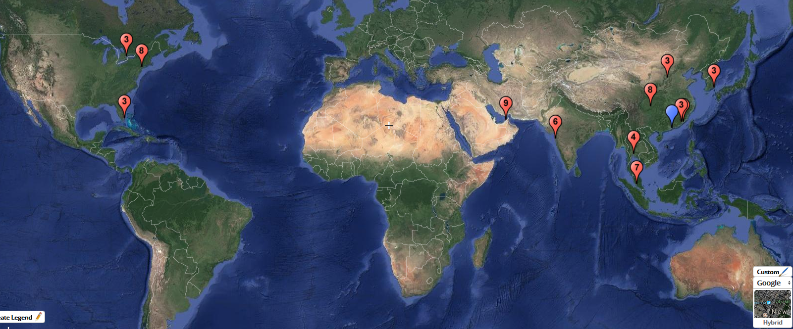 This map, based on data from Freedom House, shows the state of individual political freedom and civil liberties around the world in 2019. www.axios.com/freedom-house-freedom-around-the-world-map-6eb67eab-a1a0-4e40-8c7b-baeaae307935.html
Bird eggs come in a huge range of colors, sizes, and patterns. However, researchers have recently found that color is correlated to climate, with darker eggs more prevalent in colder climates. www.sciencenews.org/wp-content/uploads/2019/10/102519_jl_birdegg_inline1_680_desktop.png (from https://www.sciencenews.org/article/bird-eggs-laid-cold-climates-are-darker-may-keep-eggs-warm)
Today is the winter solstice in the Northern Hemisphere. This mesmerizing gif created by a Reddit DataIsBeautiful user shows how the number of hours of daylight changes throughout the year based on latitude.
www.reddit.com/r/dataisbeautiful/comments/duax05/oc_hours_of_daylight_as_a_function_of_day_of_the/ |
Blog sharing news about geography, philosophy, world affairs, and outside-the-box learning
Archives
December 2023
Categories
All
|
 RSS Feed