|
Have 5 minutes? 15 minutes? 30 minutes? National Geographic Kids provides suggestions for short videos, quizzes, car games, even an experiment. goo.gl/1wtMCI
0 Comments
In New York last week, all UN member countries agreed to tackle the growing problem of antibiotic resistance, which may kill as many 10 million people a year by 2050 (up from 700,000 at present). This geo-graphic shows where drug resistance is most likely to be a problem (India) and least likely (Norway) and that the problem has worsened in 22 of 27 countries studied. www.economist.com/blogs/graphicdetail/2016/09/daily-chart-16
Doctors Without Borders is sponsoring a series of events on the global refugee crisis in Washington, DC, Oct. 1-9. "Forced From Home" will feature talks and guided tours of a mock refugee camp with aid workers near the Washington Monument. The exhibit will be heading to Boston, Pittsburgh, and Philadelphia next. To get (free) tickets, see http://www.forcedfromhome.com/about/
~~~ I am teaching "Mission Possible: Global Issues, Leadership Choices," my world affairs class/simulation for 7th-12th graders, by special arrangement this fall. If interested, please contact me. Due to tectonic plate activity, navigation maps for Australia need to be updated because the continent has moved about 5 feet since maps were last corrected in 1994 and because GPS-based navigation requires more precision than maps of a generation ago. news.nationalgeographic.com/2016/09/australia-moves-gps-coordinates-adjusted-continental-drift/
This map shows where the world's billionaires are, by country, and how they came to have their $$. cdn.howmuch.net/content/images/1600/world-map-of-billionaires-5bd3.jpg
Professors of philosophy discuss the philosophical underpinnings of seven movies in this short article recently recirculated by The Guardian (UK): www.theguardian.com/film/2015/apr/14/force-majeure-films-philosophy-memento-ida-its-a-wonderful-life
Earlier this week the Daily Mail (UK) published this map showing the world's largest city at different intervals across 10,000 years of human history. www.dailymail.co.uk/travel/travel_news/article-3802506/From-Jericho-Tokyo-Map-reveals-cities-largest-world-one-held-title-just-1-000-inhabitants.html
High school students interested in spending this summer or the 2017-18 academic year abroad learning a language (for free!) have until Oct. 27 to apply to NSLI-Y. Possible languages: Arabic, Chinese, Hindi, Korean, Persian, Russian, and Turkish. All costs picked up by the U.S. State Department. http://www.nsliforyouth.org/
Why have gasoline prices gone up on the East Coast recently? This map shows the Colonial Pipeline, which normally transports about 40% of the gasoline sold on the East Coast. The Colonial Pipeline developed a leak in Alabama earlier this month, requiring it to be shut down for repairs and squeezing gasoline supplies in the states served. Service has reportedly been restored. www.colpipe.com/images/default-source/default-album/colpipe-map.png?sfvrsn=2
Interested in learning more about U.S. involvement in Africa during the Cold War? On Friday (9/23) Nancy Mitchell will be talking about her new book Jimmy Carter in Africa: Race and the Cold War, which begins its story in the aftermath of Henry Kissinger's failed effort "to encourage the disintegration of Angola.” 1:00-3:00 pm at the Wilson Center. Free and open to the public. www.wilsoncenter.org/event/henry-kissinger-jimmy-carter-africa-race-the-cold-war
Is your state an ecological creditor or debtor? This map shows how states' usage of resources compares to their biocapacity. (Biggest debtor: Maryland.) news.nationalgeographic.com/2015/07/biocapacity-and-ecological-footprint/
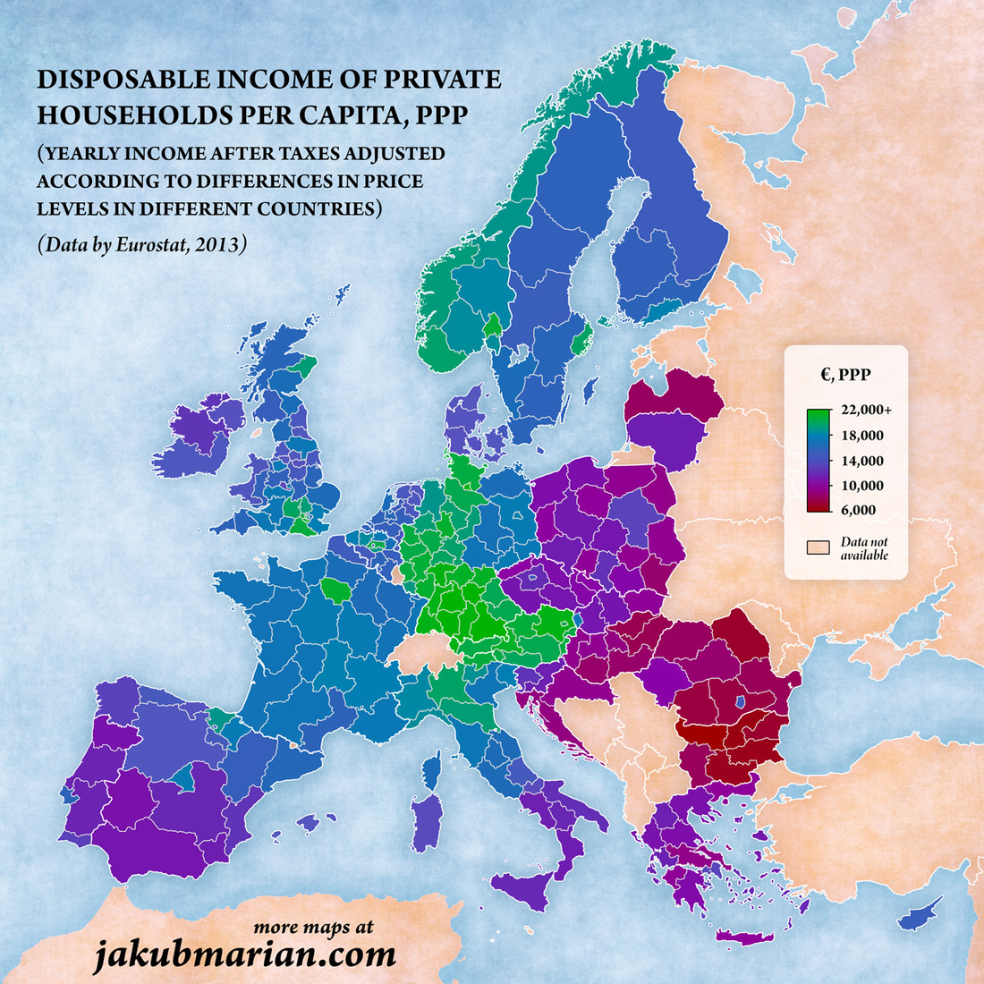
This map highlights the urban/rural and core/periphery disparities in disposable income across western and central Europe. jakubmarian.com/wp-content/uploads/2016/09/nuts2-disposable-income-europe.jpg
Are we really here? Is our world real or a figment of our imaginations? That's part of philosophy's classic "brain in a vat" problem. This article looks at the issue from the perspective of theoretical physicists. Their conclusions may surprise you. www.bbc.com/earth/story/20160901-we-might-live-in-a-computer-program-but-it-may-not-matter
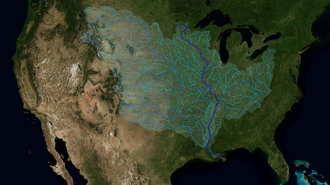
Combination of map and animation, this NASA link shows the drainage area of the Mississippi River, the world's 5th largest watershed by area. NASA article: svs.gsfc.nasa.gov/4493
Video: svs.gsfc.nasa.gov/vis/a000000/a004400/a004493/Mississippi_1080p30.mp4 On Monday (9/19) at 10:00 am Eastern Time students can participate in a live video conference with Asha de Vos, a Sri Lankan marine biologist, who will talk about her work with blue whales in the northern Indian Ocean. This opportunity -- connecting students with researchers, explorers, and conservationists -- is made possible by the National Geographic Society Explorer Classroom project. To register for Monday's video conference and access the supplemental resources, visit nationalgeographic.org/education/programs/explorer-classroom/
More than half of the world's population is now living in urban areas. Based on a study of 11 variables -- ranging from unemployment to provision of basic services to pollution levels to homicide to exposure to natural hazards -- a team of researchers produced this map, showing the world's most fragile cities. www.thechicagocouncil.org/sites/default/files/Muggah%20Fragile%20Cities.PNG
The U.S. Institute of Peace and the American Foreign Service Association have announced that the topic for this year’s high school essay contest will be the global refugee crisis. Essays are to be written in the form of a memo providing background and policy suggestions from an imaginary foreign service officer posted in Turkey, Kenya, Iraq, or Afghanistan. Entries are due by March 15. For all the details, see http://www.usip.org/AFSAEssayContest
~~~ I am teaching "Mission Possible: Global Issues, Leadership Choices," my world affairs class/simulation for 7th-12th graders, by special arrangement this fall. If interested, please contact me. It is easy to forget that what we call another country, in English, is often not what it calls itself. This map shows the countries of Europe labeled with their names in their own languages. scontent-iad3-1.xx.fbcdn.net/v/t1.0-9/14199248_1223590284351384_1762268652619927771_n.jpg?oh=7666d3ca8a07d5cb0300d88d9b9f997b&oe=5845616A
Data released by the Pew Research Center last week shows that most Hispanics living in the U.S. were born in the United States and are not immigrants. This map, which appeared in The Wall Street Journal, provides more detail and shows the South to be the main exception to this shift.
If you've ever wondered about existentialism, there's a user-friendly summary of Jean-Paul Sartre's existentialism in the current issue of Philosophy Now. It's easier to read than Sartre :-).
https://philosophynow.org/issues/115/On_Being_An_Existentialist This map, from the Institute for the Study of War and based on data current through last week, hints at the complexity of the military situation in Syria. News reports of a possible peace deal brokered by the U.S. and Russia tend to gloss over the difficulties of deciding who belongs at the negotiation table. For a more detailed image, see www.understandingwar.org/sites/default/files/September7%20EDITS%20COT.pdf
This is the final month to see "The Greeks," the current exhibition at the National Geographic Museum in downtown DC.
"The Greeks: Agamemnon to Alexander the Great is an exceptional journey through 5,000 years of Greek history and culture. This exhibition features more than 500 priceless treasures—many of which have never been on display outside of Greece." The exhibit closes Oct. 10. http://nationalgeographic.org/museum/greeks Prior to last week, we had more accurate maps of Mars than we did of Alaska!
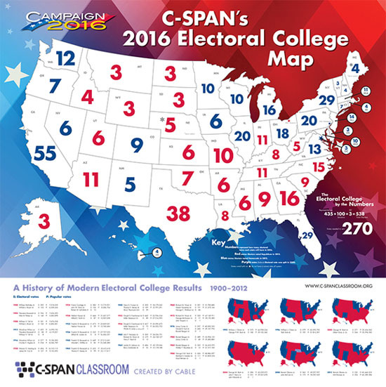
"Exactly one year ago, President Barack Obama became the first sitting president to set foot above the Arctic Circle, visiting the small town of Kotzebue on Alaska's northwest coast. At least we think that's where he was. Alaska, like much of the Arctic, is remote, often ice- and fog-bound, and is therefore among the poorest mapped places on the planet. Some of the coastal charts still use data compiled by Captain Cook." news.nationalgeographic.com/2016/09/alaska-has-finally-been-mapped-as-precisely-as-mars/ You can get this huge (44"x44") map showing electoral college votes by state for free by signing up with C-SPAN Classroom. Although the numbers are for each state's electoral college votes, they're also a proxy for relative population size. www.c-spanclassroom.org/special-offers.aspx
Asia's first locally transmitted Zika cases were announced last week in Singapore. This map, developed by researchers at the University of Kansas, is the most detailed to date of the possible spread of Zika, based on host mosquito range, climate, and socioeconomic factors.
https://images.sciencedaily.com/2016/08/160810141936_1_900x600.jpg |
Blog sharing news about geography, philosophy, world affairs, and outside-the-box learning
Archives
December 2023
Categories
All
|


 RSS Feed