|
The life expectancy of Americans varies significantly based on where they live, as this map, based on pre-pandemic average life expectancies, shows. (Map and an interesting discussion of the cultural and political dynamics that underlie it at www.politico.com/news/magazine/2023/09/01/america-life-expectancy-regions-00113369.)
0 Comments
Fast forward to 2050: this geo-graphic from Statista looks at the anticipated number of retirees per 100 working people, in selected countries, in 2020 vs. 2050. Numbers in 2050 range from 40.4 retirees per 100 working people in the U.S. to 80.7 (!) retirees per 100 working people in Japan. The length of the bar highlights the change in value from 2020 to 2050. www.statista.com/chart/30831/evolution-of-the-number-of-retirees-per-100-working-people
Students who have taken my "Your Future World: Human Geography 2050" class will be familiar with the demographic shifts highlighted in this graphic, based on UN data and forecasts, that will shape the world in which they live. www.statista.com/chart/29853/the-worlds-most-populous-countries-since-1950 (I expect to teach "Your Future World" online for the first time in Spring 2024.)
According to the latest Census data released last week, Black Americans are continuing to move out of urban areas in the North, Midwest, and West, some departing for nearby suburbs and some for urban areas in the South. (Map from www.wsj.com/articles/black-americans-are-leaving-cities-in-the-north-and-west-c05bb118.)
Although it's been widely reported that India will overtake China as the world's most populous country at some point this year, what has received less attention are the divergent trends in fertility rates within India: the birth rate in northern India is nearly twice that of southern India. In southern India, the total fertility rate is 1.8 children per woman, on a par with the U.S. and most of Europe. In northern India, the total fertility rate is about 3 children per woman, on a par with Namibia and Libya, among other countries. "Not only are southern [Indian] states providing women better access to contraceptives and family planning services, experts say, but they’re also affording women better educations, more jobs and higher relative social status — crucial, intangible factors that have led to smaller family sizes and greater prosperity. 'Demographically, we have two Indias,' said Arvind Subramanian, the Indian government’s chief economic adviser between 2014 and 2018. 'The India of the south already resembles East Asia. It’s actually in the early stages of aging. But the Hindi heartland is still very much booming.' ... The north-south gap in birthrates and overall development is stirring frequent debates about how to apportion federal spending and how to allocate seats in Parliament. It’s also sparked efforts by government leaders and development experts to provide enough jobs to the poor, northern states — and lift up women like Malika [a woman profiled in the story from the northern state of Bihar], who are left behind even as India’s surging economy looks destined to overtake Germany’s later this decade. ... According to the 2021 national family survey, 84 percent of Tamil Nadu women are now literate, compared with 55 percent in Bihar, the lowest in India. Forty-six percent of married women in Tamil Nadu were employed in the last 12 months, versus 19.2 percent of married Bihari women. ... Increasingly, India’s failure to close its north-south demographic and economic divide is leading to political consequences. In Bihar, the pressure on public-sector employment is so great that cuts to government job openings or in military recruitment often spark riots. Meanwhile, southern states such as Tamil Nadu, which is expecting to see its population decline sometime in the next decade, has seen an influx of northern migrant laborers, occasionally leading to friction."
www.washingtonpost.com/world/2023/04/14/india-china-population-most-populous/ Do the old have a moral obligation to move out of the way to make room for the young? Or is even suggesting this perpetuating dangerous bias against the elderly and vulnerable? These may not be theoretical questions much longer in rapidly aging societies. A case in the point is the traction the provocative statements of Yale economist Yusuke Narita have gotten in Japan, where those 65 and older make up roughly 30% of the population and those 80 and older account for 10% of the population. www.nytimes.com/2023/02/12/world/asia/japan-elderly-mass-suicide.html
Megacities are generally defined as metropolitan areas of at least 10 million people. There are currently 33-35 megacities, depending on who is counting and who is being counted. This map looks at cities expected to reach megacity status by 2050: bucket.mlcdn.com/a/2764/2764870/images/0d7ca37bc55b1c8101a1a5e77cb243aae75162b2.jpeg
This interactive map from the Census Bureau shows which U.S. states have the largest proportions of senior citizens (the greener the state, the larger the proportion of the population age 65 or older): www.census.gov/library/visualizations/interactive/population-65-and-older-2021.html
Yesterday, the world population hit 8 billion according to United Nations estimates. Globally, the population is expected to climb to about 10.4 billion around the turn of the century and then taper off. But these new 2.4 billion people will not be evenly distributed around the planet. This article highlights where there are expected to be concentrated population booms, where the population is expected to decline, where the population is aging rapidly, and what it all means: www.washingtonpost.com/world/interactive/2022/world-population-8-billion/
One of my geography classes recently explored family ancestry and the related issues of immigration patterns and language dispersal. This set of maps from The Washington Post illustrates the concentration of Nordic ancestry in the Upper Midwest. (Map from www.washingtonpost.com/business/2022/10/07/midwest-orchestras-conservatories-airbnb/.)
COVID cut global life expectancy, but the impact even among relatively affluent countries was highly uneven. Researchers studied life expectancy in 29 countries (mostly European plus the U.S. and Chile) between 2019 and 2021. In one -- Norway -- life expectancy continued to edge upwards, as had been the long-term trend in all of the countries studied, but in each of the 28 other countries, life expectancy fell by months to years. Between 2020 and 2021, most Western European countries stopped or even reversed the decline in life expectancy, but in the U.S., Chile, and Eastern European countries, life expectancy continued to decline through 2020-2021. U.S. life expectancy declined 2.75 years through the study period, second only to Bulgaria, which saw a decline of 3.5 years. (Study summary at www.statista.com/chart/28487/life-expectancy-change-selected-countries/ includes the link to the Nature Human Behavior article.)
Partitioned from the rest of the island when Ireland (the country) was granted independence in 1921, Northern Ireland, which is part of the UK, is the historically Protestant-majority northeastern section of Ireland (the island). However, a recent census shows that Catholics now outnumber Protestants in Northern Ireland for the first time. www.nytimes.com/2022/09/22/world/europe/northern-ireland-census-catholics-protestants.html
Western Europe is one of the world's most rapidly aging regions. This geo-graphic looks at the anticipated increase in dementia rates by 2050 in a sampling of Western European countries: cdn.statcdn.com/Infographic/images/normal/28310.jpeg
Hal Brands, professor at the Johns Hopkins School of Advanced International Studies and former Special Assistant to the Secretary of Defense for Strategic Planning and lead writer for the Commission on the National Defense Strategy for the United States, released an important and somewhat contrarian new book this week arguing that China is likely to try to invade Taiwan within the next five years. Danger Zone lays out the case that far from being a rising power, China is a peaking power due to the convergence of a variety of serious demographic, economic, and geopolitical constraints, a situation that tends to make countries more reckless. "When you think about revisionist powers - so that's just a fancy political science word for countries that want to change the way the world works; they're dissatisfied with the existing order. They tend to become most aggressive, most rash, not when they are very confident about the future, when they think that things will be better a decade from now than they are now, but when they worry that their window to change the system is closing. That, either because their economy has stalled or they're becoming encircled by their enemies, or sometimes both, that they have a closing window of opportunity to achieve their objectives. And when that is the case, they become more prone to use coercion, to use violence, to use force to get what they want while they can still grab it. That's been the case historically in a variety of instances, from ancient times up to the 20th century. And it's the trap that we worry that China may be falling into today. ... [A] lot of the tailwinds that propelled China to where it is today have now become headwinds. Assets have become liabilities, so to speak." The book makes the argument for China's status as a peaking power and details what the U.S. and its allies can do, now, to head off possible Chinese aggression in the Pacific. (Quote from Brands' interview with the "Intelligence Matters" podcast: www.cbsnews.com/news/hal-brands-on-potential-of-future-conflict-with-china-intelligence-matters/.)
According to a new report from the United Nations, global population is projected to hit 8 billion on November 15 of this year, India is expected to surpass China as the world's most populous country in 2023, and more than half of global population growth between now and 2050 will be concentrated in just 8 countries (alphabetically): the DRC, Egypt, Ethiopia, India, Nigeria, Pakistan, the Philippines, and Tanzania. For all the details, you can download the report here: www.un.org/development/desa/pd/sites/www.un.org.development.desa.pd/files/wpp2022_summary_of_results.pdf
Across the U.S., about half of all adults are currently married, 10-12% are currently divorced, and about one-third have never been married. The "never married" group is growing fastest. This map highlights the states with the largest percentages of adults who have never been married. 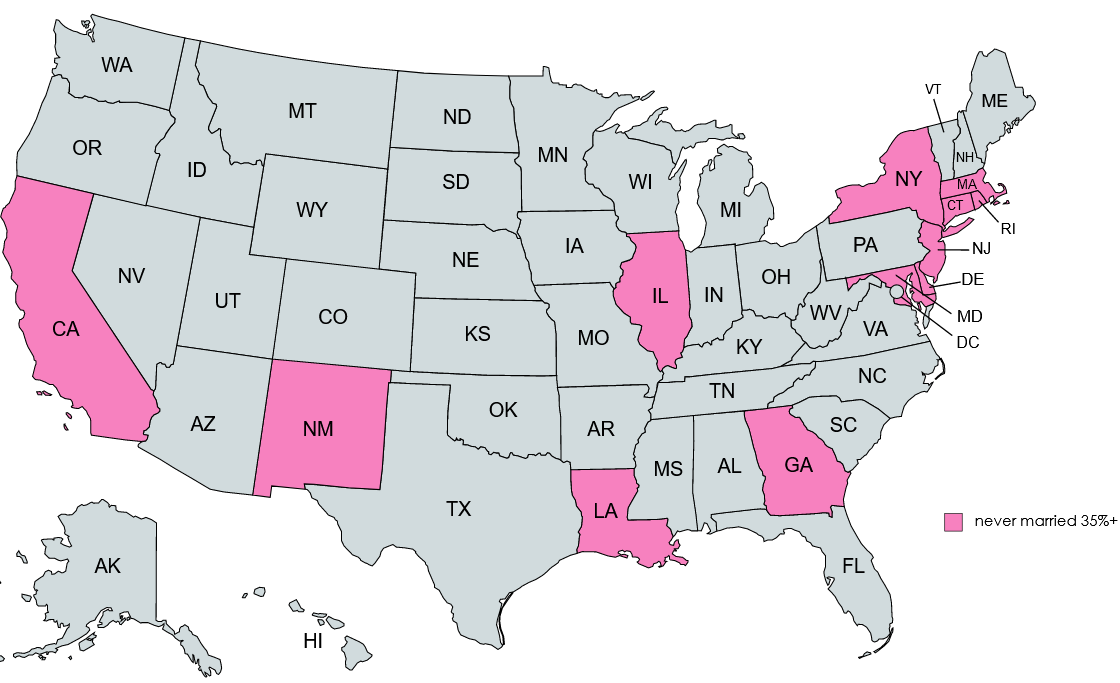 One in four American adults is considered "inactive," defined by the Centers for Disease Control as not participating in any physical activity outside of work over the last month. The prevalence of inactivity varies considerably by state and ethnicity, as this series of maps shows: www.cdc.gov/physicalactivity/data/inactivity-prevalence-maps/index.html#overall
Not a map but a different visual display of geographic information: this chart from The Economist (UK) shows average life expectancy at birth by country and the gap, in years, between male and female life expectancy. Every country has a longer life expectancy for females than males; those shown in the darkest blue have the largest gap between male and female life expectancy. www.economist.com/graphic-detail/2021/02/04/why-women-are-less-likely-than-men-to-die-from-covid-19
According to a recent report by the International Work Group for Indigenous Affairs, an estimated 4.3 million Americans (corresponding to 1.3% of the U.S. population) is Native American. In Bolivia, by contrast, nearly half of the population is indigenous. www.statista.com/chart/19633/countries-by-indigenous-population-in-the-americas
The northeastern Indian state of Assam (shown in red on this map) has been in the news recently. Although Assam is famous for its tea and silk, more recently Assam has been in the news for its efforts to evict Muslim residents whose families arrived from neighboring Bangladesh any time in the last 50 years. High birth rates and land erosion from the Brahmaputra River, which runs east to west the length of Assam, has increased competition for land and given Assam's Hindu-nationalist BJP government a pretext for taking action against Muslim settlers of Bangladeshi descent, most of whom were born in Assam. upload.wikimedia.org/wikipedia/commons/thumb/e/ec/India_Assam_locator_map.svg/1574px-India_Assam_locator_map.svg.png
This geo-graphic looks at who was granted asylum in the U.S. in FY2019, by country of origin, and how that mix has been changing. www.statista.com/chart/25619/asylum-grants-in-the-us-by-nationality
The headline that seemed to emerge from the recent release of the 2020 Census results was that the U.S. was becoming less "white." (What is less frequently mentioned is that at least some of that "decline" was due to a proliferation of other boxes to check.) Census data shows that the Midwest and Rust Belt diversified the fastest from 2010 to 2020. In many cases, the counties that diversified fastest were also those likely to have seen overall population declines between 2010 and 2020. (Map from www.wsj.com/articles/where-is-america-diversifying-the-fastest-small-midwestern-towns-11628860161.)
Last week, the Centers for Disease Control announced that 2020 saw an acceleration in the longtime decline in U.S. birthrates. Total fertility rates in the U.S. now hover around 1.6 children per woman. (A TFR of 2.2 is considered replacement level.) Twenty-five U.S. states had more deaths than births in 2020. This article from Foreign Affairs considers the role demographics plays in geopolitics. www.foreignaffairs.com/articles/world/2019-06-11/great-demographics-comes-great-power
One of the enduring artifacts of the coronavirus pandemic is a decline in birth rates. In the U.S., for example, there were 300,000 "missing" births in 2020. In China, though, the pandemic hit when the country was already having limited success convincing couples, most of whom grew up as only children themselves, to have more than one child. China "faces a shrinking labor force, a skewed sex ratio and one of the world’s fastest-aging populations. Data released by the Ministry of Public Security in February showed a 15 percent drop in registered new births in 2020. ... Bleak demographic predictions have fanned fears that the country will grow old before it grows rich, as decades of restricting family size compound the effects of urbanization and growing wealth in curbing birthrates. China’s population could begin shrinking as early as 2027, according to an estimate from the Chinese Academy of Social Sciences, and citizens over the age of 65 will account for 20 percent of the population by 2025. ... Urban couples especially, daunted by the cost and pressure of raising a child in China’s hypercompetitive cities, are increasingly forgoing parenthood. ... Others fear that officials will reorient the gigantic family-planning bureaucracy, which enforced restrictions through forced abortions, sterilizations and steep fines, toward pushing women to have children. Recent proposals to inspire more births range from lowering the minimum age for marriage to 18 (from 20 for women and 22 for men) to using education to encourage women between the ages of 21 and 29 to “give birth in a timely manner.”“I am pessimistic that lifting childbirth limits will put women’s status further behind. I feel like scenes from ‘The Handmaid’s Tale’ could really happen. I just don’t know when,” [former journalist Chen Hongyu] said."
www.washingtonpost.com/world/asia_pacific/china-child-policy-population-growth/2021/03/05/16dd613a-75b8-11eb-9489-8f7dacd51e75_story.html Urban areas in the U.S. have traditionally been Democratic strongholds. This New York Times analysis of 2020 election data suggests the facts on the ground are more nuanced: immigrant neighborhoods in large cities became more "red" and less "blue" in 2020, not just in easy-to-explain cities like Miami but in a range of cities from Chicago and Philadelphia to NYC and Los Angeles. (Check out the detailed maps in the article itself.) www.nytimes.com/interactive/2020/12/20/us/politics/election-hispanics-asians-voting.html
|
Blog sharing news about geography, philosophy, world affairs, and outside-the-box learning
Archives
December 2023
Categories
All
|
 RSS Feed