|
This GIF from the National Audubon Society and the Cornell Lab of Ornithology shows annual bird migrations in the Western Hemisphere. (These maps are based on bird observations from 2002 to 2014 and do not necessarily reflect the recent data finding that North America has lost nearly 30% of its bird population since 1970.) www.audubon.org/news/see-millions-places-migrating-birds-have-gone-one-gif
0 Comments
The cacao plant, whose pods are used to make chocolate, is native to Latin America. But today Cote d'Ivoire produces 30% of the world's cacao, accounting for two-thirds of Cote d'Ivoire's foreign trade. This map shows the top 10 countries by cacao production. www.worldatlas.com/articles/top-10-cocoa-producing-countries.html 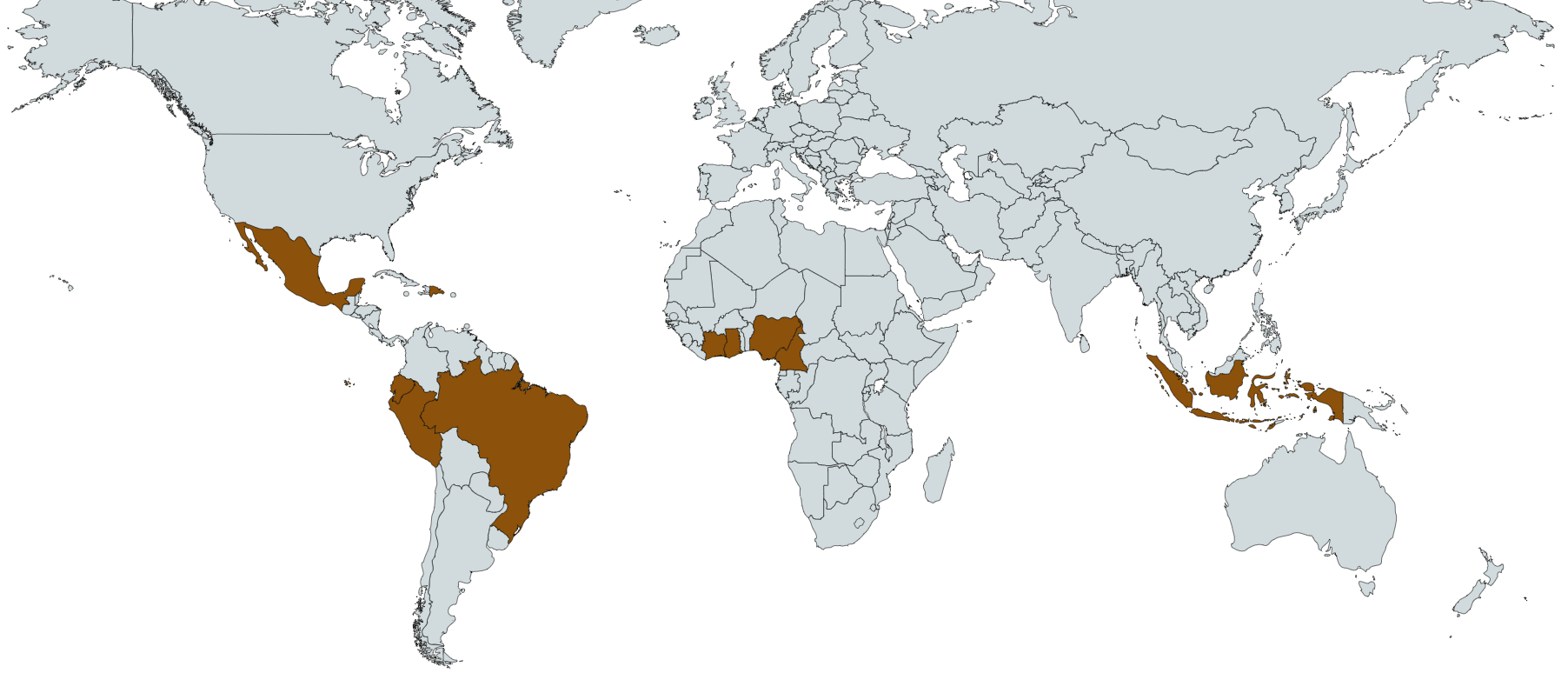 Hyperinflation and economic collapse in Venezuela have led to increases in violence, malnutrition, and disease as well as the exodus of more than 3 million Venezuelans since 2014. The Center for Strategic & International Studies estimates that throughout 2018 an average of 3,000 people per day were crossing from Venezuela into Colombia alone. This map looks at where most Venezuelans migrants have gone. ichef.bbci.co.uk/news/624/cpsprodpb/CDBC/production/_103886625_venezuela_map_migration_destinations_640-nc.png
Scientists analyzing the massive 8.2 earthquake that rocked Mexico in September 2017 have found that the earthquake actually broke the Cocos tectonic plate in two.
www.nationalgeographic.com/science/2018/10/news-tectonic-plate-split-earthquakes-tsunamis-geology This map compares when slavery was formally abolished in the Western Hemisphere. (Because of colonization patterns, not everything lines up neatly with contemporary nation-state borders.) hillfighter.deviantart.com/art/Abolition-of-Slavery-Americas-215869460
"The question that dominates my waking hours now is: When Day Zero arrives, how do we make water accessible and prevent anarchy?" says the mayor of Capetown, South Africa, in a recent National Geographic article on Capetown's water crisis. [As I noted in a different post a few weeks ago, Capetown is expected to have to turn off its public water supplies in two months (more or less, depending on the success of water conservation efforts) because the water level in the city's reservoir is approaching, functionally, zero. The army is on standby to maintain order.] This article from the BBC (UK) looks at 11 other major cities likely to run out of drinking water (Cairo? London? Bangalore? Sao Paulo? Beijing? Istanbul?): www.bbc.com/news/world-42982959
These GIFs show the steady progression in median ages in the Western Hemisphere and Europe from 1960 to 2060. www.visualcapitalist.com/animation-rapidly-aging-western-world/
This map is based on data from Latinobarómetro, an opinion poll conducted in 18 Latin American countries annually. i.imgur.com/wDWqFq3.png
Transparency International is an NGO that seeks to end corruption by shining a bright light on it. (My students frequently use Transparency International data in their cultural geography research.) Earlier this month Transparency International released a new report on Latin America and the Caribbean. This map shows what % of respondents in each country report having paid a bribe in the last 12 months. There is considerable variability when it comes to what bribes have to be paid for, though: in Honduras it might be within the court system, in Venezuela it might be for access to utilities, in Mexico it might be for schools or medical care. To read the report, see
www.transparency.org/news/feature/corruption_on_the_rise_in_latin_america_and_the_caribbean El Salvador reported yesterday that Thursday was its first day without a murder since January 22, 2015. El Salvador and its neighbor Honduras have the world's highest homicide rates. Although Latin America and the Caribbean contain only about 8% of the world's people, countries in the region account for roughly 1/3 of all homicides globally. This interactive visualization tool maps out global homicide patterns (based on 2015 data): homicide.igarape.org.br/
My students know (I hope) that if we were to walk from the U.S. to South America, Colombia would be the first South American country we would reach. But few Americans have an appreciation for how big Colombia is. This map tries to provide some perspective by fitting a number of more familiar countries and U.S. states -- including Germany, Florida, Switzerland, Austria, and New Jersey -- into Colombia.
https://scontent-iad3-1.xx.fbcdn.net/v/l/t1.0-9/15780929_1349460508431027_2380957439267568808_n.jpg?oh=308f45d0bf4e73e71b70ec460b493f14&oe=58E20FAC These stunning maps of river basins were created using geographic information system (GIS) software to track each river and its tributaries. www.iflscience.com/environment/these-colorful-maps-show-that-river-basins-are-surprisingly-interesting/
Over the weekend, voters in Colombia stunned their president and pollsters by narrowly rejecting a peace deal with the country's FARC rebels. Some have speculated that Hurricane Matthew was at least partly to blame: Matthew brushed Colombia's northern coast immediately before the voting, destroying homes, roads, and polling places. This map shows that the provinces sustaining the most damage from Matthew -- Magdalena, La Guajira, Bolivar, Atlantico, and Sucre -- all supported the peace deal. img.washingtonpost.com/rf/image_1484w/2010-2019/WashingtonPost/2016/10/03/Foreign/Graphics/2300-colombia1004-v2.jpg
|
Blog sharing news about geography, philosophy, world affairs, and outside-the-box learning
Archives
December 2023
Categories
All
|
 RSS Feed