|
According to U.S. Census projections, by 2025 nearly half (49%) of all Americans will live in just eight states (shown in light blue on my map). One in seven Americans will live in California alone. (For those who like to plan ahead, by 2040 at least half of all American will live in eight states, but Georgia and North Carolina are expected to supplant Ohio and Michigan on the list of eight states.) For the Census data, see https://www.census.gov/prod/2/pop/p25/p25-1131.pdf. For a look at 2040, see www.washingtonpost.com/news/politics/wp/2018/07/12/in-about-20-years-half-the-population-will-live-in-eight-states 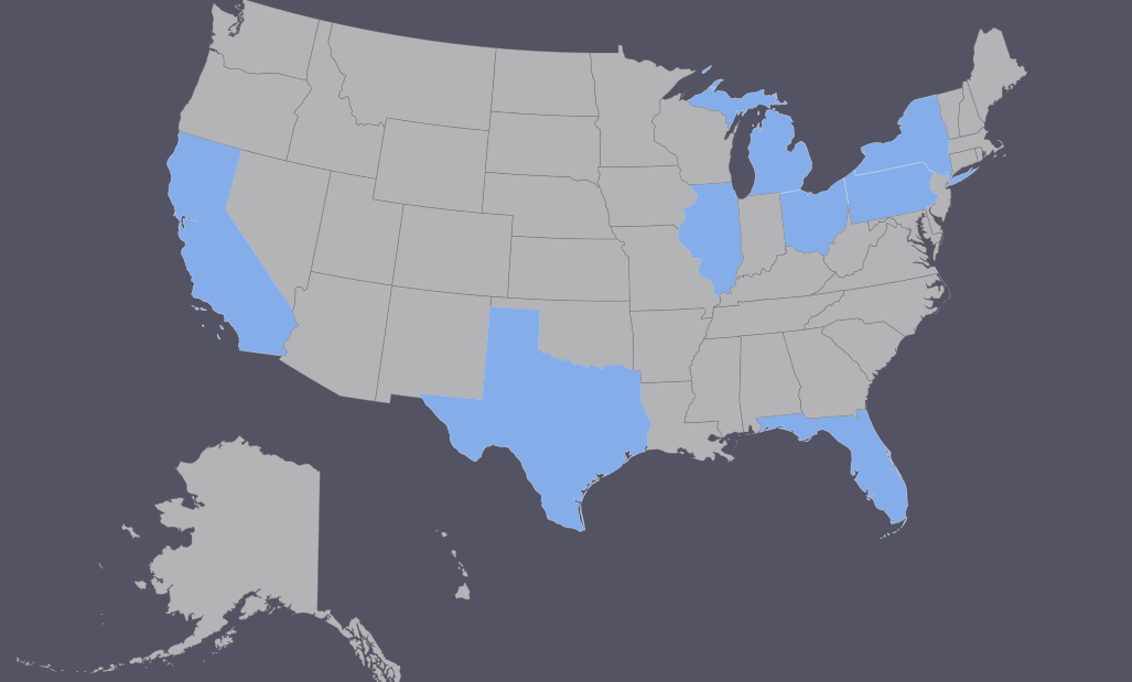
0 Comments
Israel is facing a particularly difficult leadership choice in the coming months and years: does it want to preserve its democracy or does it want to preserve its Jewish majority? New data in a report delivered to the Israeli Knesset recently suggest the numbers of Jews and Arabs in the land currently controlled by Israel (from the Jordan River to the Mediterranean) are now essentially equal. Although this demographic issue has been discussed, and dismissed, as a possibility for years, the Israeli army's Civil Administration unit reports that it is now a fact. www.al-monitor.com/pulse/originals/2018/04/israel-palestinians-demography-jordan-river-apartheid.html
This unusual topological map compares the life expectancy in each U.S. state to the national average from 1980 to 2014. Where you can see gold, a state's life expectancy exceeds the national average; where you can see lavender, a state's life expectancy is lower than the national average. The shape of the colored region indicates how closely a state's change in life expectancy paralleled the increase in U.S. life expectancy over this period: Minnesota's life expectancy, for example, has been consistently higher than the national average, whereas South Carolina's has been consistently lower, and Oklahoma has lost ground, while New York has gained ground. espnfivethirtyeight.files.wordpress.com/2017/05/barry-jester-life-expectancy-2.png
Between 1950 and 2016, the population of the U.S. more than doubled, growing by roughly 114%. But, as this map shows, that population growth was not spread evenly across the country. In fact, none of the states in gold (and West Virginia, in red) kept pace with national trends in population growth. factsmaps.com/us-states-population-growth-rate-1950-2016/
This map compares countries by median age: purple = very low median age (in mid-teens), dark green = very high median age (in mid-forties).
i.redditmedia.com/umh710v0JMVz8ZzAIoIE3aPcpxWBUnaT5kQOehFUSWY.png?w=1024&s=b425f7aa42f528815da064f49396921d A cartogram is a map that has been weighted for a particular variable. This pair of cartograms was created to mark the recently concluded World Economic Forum in Davos, Switzerland. The top cartogram adjusts country size according to current population. The bottom cartogram adjusts country size according to economic output as measured by GDP. www.viewsoftheworld.net/wp-content/uploads/2018/01/TheWorldIn2018.png
These GIFs show the steady progression in median ages in the Western Hemisphere and Europe from 1960 to 2060. www.visualcapitalist.com/animation-rapidly-aging-western-world/
As many of my geography students know, a country needs a total fertility rate (TFR) of 2.1 children per woman if it wants to have a population that is neither growing nor shrinking. China has a TFR of about 1.2, meaning that its population is both aging and (eventually) shrinking. The Economist (UK) looks at how and why fertility rates vary across China, from low (1.79 in Guangxi, bordering Vietnam) to ultra-low (0.71 in Beijing). www.economist.com/news/china/21729573-no-province-has-many-babies-some-shortfalls-are-much-worse-others-chinas-demographic
This interactive mapping site looks at child care availability in the U.S. by comparing the number of children under age 5 in any Census tract to the number of spots available with licensed child care providers. Mouse over the map at the site for state-level information and click on any state for county-level detail. childcaredeserts.org/
Land use is a volatile issue in Kenya (as seen in the country's recent and now invalidated election) and across Africa. The continent's degrading soil conditions and mushrooming populations -- from 230 million in 1950 to 630 million in 1990 to more than 1.2 billion today and possibly 4 billion by the end of the century -- are on a collision course. This map, from The New York Times, shows where the problems are particularly acute. To read the NYT story, see www.nytimes.com/2017/07/29/world/africa/africa-climate-change-kenya-land-disputes.html
This map uses country flags to show the largest immigrant population within each European country. Great Britain, for example, is home to more people born in India than any other country (other than Great Britain itself). Likewise, Romanians are the largest immigrant group in Spain, Italy, and Hungary, and Algerians are the largest immigrant group in France. d36tnp772eyphs.cloudfront.net/blogs/1/2017/06/Europelargestsecondnationality.jpg Need to brush up on your national flags? Try this: www.countries-ofthe-world.com/flags-of-the-world.html
Yesterday was Canada's sesquicentennial! While Canada, the country, is 150 years old, Canada also has one of the world's oldest populations, with a median age of roughly 42. (The median age in both Japan and Germany is nearly 47; the median age in the U.S. is about 38.) This map, from the Canadian magazine Maclean's, compares Canada's over-55 population with its under-25 population. www.macleans.ca/wp-content/uploads/2014/06/MAP-300dpi-old_young.jpg
U.N. population forecasts suggest that by 2050 the elderly (age 65+) will outnumber children under age 14 for the first time in history. This map, from Bank of America Merrill Lynch's Transforming World Atlas, shows aging patterns by country. www.tralac.org/images/News/Reports/Transforming%20World%20Atlas%202nd%20edition%20BofAML%20March%202016.pdf (p.10)
At present, the U.S. population stands at a bit more than 320 million. This map shows other regions of the world with roughly equivalent populations and, if you check out the key to the left of the map, the largest city within each of those regions. https://moverdb.com/united-states-population-world/
The U.S. has many Americans of Italian descent. It is less well known, at least in the United States, that South America has many more people of Italian descent. More than half (by some accounts nearly 2/3) of Argentina's population has at least one Italian ancestor, and São Paulo, Brazil, is believed to have the largest population of people of Italian ancestry outside of Italy. This map shows patterns of Italian ancestry across the Americas. img-9gag-fun.9cache.com/photo/a5bvx2r_700b.jpg
The world's population is now more than half urban, but as you might imagine this is not true uniformly. This cartogram shows where the world's rural populations reside: the greater the distortion, the more people living in rural areas; the darker the green, the greater the proportion of the population that is rural. www.viewsoftheworld.net/?p=5398
By combining NASA satellite imagery with U.S. Census data, a geographer at the University of Cincinnati has created a highly detailed, interactive map of U.S. racial geography. These maps show Chicago, for example (yellow=white, green=African American, purple=Hispanic). www.upi.com/Science_News/2017/04/21/New-digital-map-details-shifting-demographics-in-United-States/5431492799529/ For the interactive version, go to http://sil.uc.edu/webapps/socscape_usa/
Which U.S. state had the biggest population gains last year? Utah, according to this U.S. Census Bureau map. States that saw their populations shrink? Wyoming, Illinois, Mississippi, West Virginia, Pennsylvania, New York, Connecticut, and Vermont. www.census.gov/content/census/en/library/visualizations/2016/comm/cb16-214_popestimates/jcr:content/map.detailitem.800.medium.jpg/1482249323326.jpg 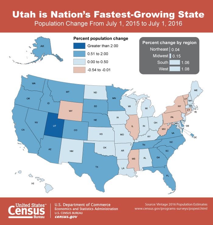 To better appreciate how lightly populated much of North Africa is, this map shows the Nile River valley and the major population centers on Morocco's Atlantic coast together account for half the region's population. http://68.media.tumblr.com/a48a10c48b4a58f65a70c73b31a4098e/tumblr_o1ab967Mob1ucqp0so1_500.png
Americans tend to think of Canada as that friendly country north of the U.S. But this map reveals what would be a surprise to many: 1/2 of all Canadians live in a narrow band that is actually south of Washington state. i1.wp.com/metrocosm.com/wp-content/uploads/2016/08/canada-population-line-map.png
A cartogram is a map weighted to reflect a particular variable. In this case, the variable is 2015 population. d36tnp772eyphs.cloudfront.net/blogs/1/2016/09/maps-population.png
Demographics may not be destiny precisely, but their direction is difficult to change, especially in the short term. A recent article from Foreign Policy highlights key demographic trends shaping our future world. "What’s notable about these disparate trends is how much they are interrelated. They’re driven not just by the traditional demographic triad of births-deaths-and-migration, but by myriad powerful new forces that define modernity — from the empowerment of women, to improvements in health care, to the information and technology revolutions, to the concurrent rise of secularization and religious fundamentalism. However, the fact that they are connected does not mean they are universal. Beneath the broad umbrella of global demographic change, there will be sharp variances across regions (and sometimes within countries)."
For example, by 2050, "the world’s fastest-growing region, Africa, is projected to see its population more than double, while the slowest-growing region, Europe, is expected to see its population decline by about 4 percent. This means that in 2050 there will be around 3.5 times more Africans (2.5 billion) than Europeans (707 million). In 1950, there were nearly twice as many Europeans as Africans." features.foreignpolicy.com/heres-looking-at-you-2050-christianity-islam-aging-population/ By most accounts, Mongolia is the least densely populated country in the world. (Mongolia's population density is <2 people per square kilometer, which is even lower than the state of Wyoming's.) This map shows that nearly half the country's population (in pink) lives in or near the capital of Ulaanbaatar. i.imgur.com/iG3wPVM.png
One of my classes ("Your Future World") studies the physical, cultural, political, historical, and economic geography of the 10 countries the United Nations has forecast to be the world's most populous in 2050. The list itself comes as a surprise to most students. As we close out 2016 and prepare to watch a clock count down to a new year, it is instructive to spend a few minutes watching a world population clock, ticking up the births and deaths around the world. The Worldometers clock includes a real-time look at population growth in the world and in the 20 countries that were the most populous at the beginning of 2016: www.worldometers.info/world-population/ The Poodwaddle clock shows real-time population growth in the world and by continent: www.poodwaddle.com/worldclock/pop/ 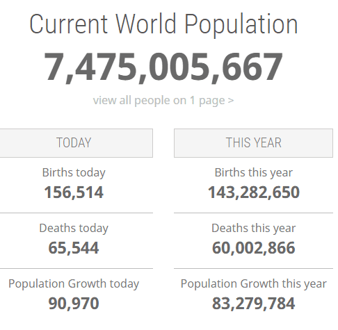 The American Museum of Natural History has produced this video showing the spread of humans across the globe and the development of major population centers over time. As the end of the video notes, "It took 200,000 years for our population to reach 1 billion. And only 200 years to reach 7 billion." www.amnh.org/explore/science-bulletins/(watch)/human/news/human-population-through-time
|
Blog sharing news about geography, philosophy, world affairs, and outside-the-box learning
Archives
December 2023
Categories
All
|
 RSS Feed