|
A new book about the impact of Amazon on American geography was recently reviewed in The Atlantic: "There are countless ways to measure Amazon’s hold on American life. More people in the U.S. subscribe to its Prime service than voted for either Donald Trump or Joe Biden in the past election: more than 100 million, by recent estimates. Amazon reaps fully half of what people in this country spend online. It is the second-biggest private workplace in the United States, after Walmart, employing more than 800,000 people, most of whom will never set foot in the Seattle headquarters’ plant spheres. Among Amazon’s large Arizona-based workforce, most of it inside warehouses, one in three people was on the federal Supplemental Nutrition Assistance Program in 2017. ... The rise of the internet in the 2000s accelerated the process in ways we’re by now familiar with, and a handful of companies—Google, Facebook, Apple, and Amazon, in particular—came to dominate large swaths of economic life. What [author Alec] MacGillis feels is underappreciated is the geographical remapping of wealth—and, with it, power—that the transformation has brought about."
www.theatlantic.com/magazine/archive/2021/03/alec-macgillis-fulfillment-amazon/617796/
0 Comments
This geo-graphic shows the world's biggest sovereign wealth funds (i.e., state-owned investment funds), by asset value as of January. (GIC Private Limited and Temasek Holdings are both Singaporean; together they would move Singapore into the #3 position.) Norway's sovereign wealth fund, the world's largest, is derived largely from its offshore oil reserves in the North Sea. It was established in 1990 "to invest government revenues from fossil fuel industries into sectors deemed more sustainable in order to provide for a future when the country can no longer rely on its income from oil" and helps give Norwegians one of Europe's highest median disposable incomes. www.statista.com/chart/24060/the-worlds-biggest-sovereign-wealth-funds
This geo-graphic from The Economist (UK) features an assessment by Oxford Economics ranking countries' vulnerability to long-term COVID-related economic damage:
www.economist.com/graphic-detail/2020/12/15/which-economies-are-most-vulnerable-to-covid-19s-long-term-effects For many countries, COVID and its associated economic impacts are contributing to what some are referring to as a "debt tsunami," an enormous wave of debt heading towards an unsuspecting shore. This topological map from The Washington Post shows debt as a percentage of GDP. (From www.washingtonpost.com/world/2021/01/10/coronavirus-pandemic-debt-crisis.)
As students in my geography classes know, the influence of a city extends far beyond the legal boundaries of the city. But the shape of a given metropolitan region is complex, determined less by physical geography or political borders than the by location of other, competing cities. An algorithm studied more than 4 million commutes to arrive at this map of U.S. economic megaregions, most of which are named for an anchor city: assets.atlasobscura.com/article_images/lg/37424/image.jpg
Last weekend the Regional Comprehensive Economic Partnership was signed by 13 Asian countries plus Australia and New Zealand to create the world's largest trading bloc, covering roughly 30% of the world's population and GDP. This map, from Asia Times, shows the 15 countries now joined in the RCEP free-trade zone (in teal). India withdrew from negotiations last year over concerns the agreement would hurt domestic producers. (The RCEP is the successor to the Trans-Pacific Partnership, which the U.S. had initialed during Pres. Obama's term in 2016 and then withdrew from on the first full day of Pres. Trump's term in January 2017. The RCEP is widely seen as a signal of China's economic influence in the region.) i0.wp.com/asiatimes.com/wp-content/uploads/2020/11/world_map_dec09.jpg
This short looping video from Visual Capitalist compares the continents by land area, population, and GDP: www.visualcapitalist.com/animated-map-the-comparative-might-of-continents/
This map, based on Census data, considers the percentage of adults in each state who have at least a bachelor's degree. Nationally, an average of 30.9% of adults have at least a bachelor's degree. (The states in blue, red, and white have education rates above this national average; the states in yellow, green, and peach have education rates below this national average.) 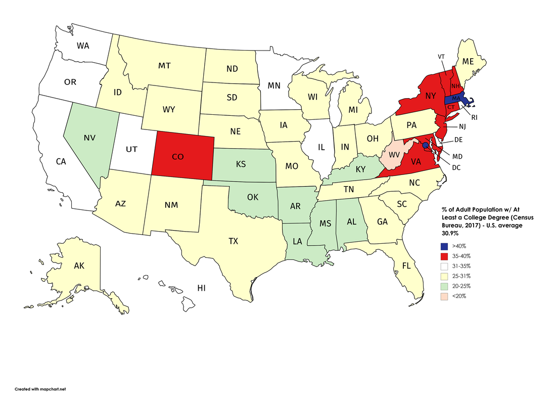 In August, the Dallas Housing Authority "was tasked with distributing $4 million to income-eligible renters before Dec. 31 as part of the $2 trillion Coronavirus Aid, Relief and Economic Security Act. To meet the deadline and ensure the funds would reach the neediest families, DHA staffers customized an existing software program from Zoho Corp. to automate tasks and map the most economically vulnerable neighborhoods in the city." www.wsj.com/articles/dallas-agency-brings-coding-in-house-to-target-covid-19-aid-11601631000
Between now and the middle of this month, many state moratoriums on utility shutoffs are set to expire. This topological map, from The Wall Street Journal, shows the number of unemployed people at risk of having their utilities shut off, by state. (from https://www.wsj.com/articles/more-homes-are-going-dark-as-moratoriums-on-utility-shut-offs-end-11601112601)
This Reddit map based on Eurostat data shows youth unemployment in Europe (before COVID): i.redd.it/z7y1d5rirqn51.png
Today is Labor Day. If today is a paid holiday for you or someone in your family, thank a labor union. Last Friday's jobs report showed that the U.S. unemployment rate fell below 10% in August, but the number of jobs lost permanently, rather than temporarily, has climbed. Service workers who can't work remotely remain particularly hard hit by job losses. This map from The New York Times shows the geography of remote work: not surprisingly, workers' ability to work from home is highest (shown in red) in urban areas that tend to have higher proportions of information workers. (from https://www.nytimes.com/2020/09/04/business/economy/service-economy-workers.html)
This geo-graphic from The Washington Post shows the proportion of businesses closed, by state, between March 1 and July 10. Hawaii and Nevada, both heavily reliant on tourism, have been the hardest hit. North and South Dakota, by contrast, have seen the fewest relative business closings. www.washingtonpost.com/wp-apps/imrs.php?src=https://arc-anglerfish-washpost-prod-washpost.s3.amazonaws.com/public/GLOKDHEWMBHRBD2JUZ3ZRY4OMM.png&w=916
This topological map, based on data from the Forbes World Billionaires List, shows the world's 35 richest women, by continent, and lists the source of their wealth. howmuch.net/articles/wealthiest-women-in-the-world
This interesting geo-graphic from HowMuch.net shows the world's 10 biggest economies (as measured by GDP) from 1980 to 2021. howmuch.net/articles/worlds-biggest-economies-over-time
Geopolitical tensions and pandemic-related lockdowns have raised concerns about China-centric supply chains, including supply chains for pharmaceuticals. This geo-graphic, from data compiled by Goldman Sachs in The Wall Street Journal, illustrates that China is far and away the world's leading exporter of active pharmaceutical ingredients. India, for example, may supply more than 40% of the generic drugs sold in the U.S., but India, in turn, relies on China for the active ingredients.
(from www.wsj.com/articles/drug-industrys-china-habit-will-take-time-to-kick-11595851558) Between February and May, the number of American households receiving food stamps grew by 17%, the fastest increase in the program's history. This topological map from the New York Times shows changes by state. (Data not available from states shown in gray.) From www.nytimes.com/2020/07/19/us/politics/coronavirus-food-stamps.html
Openness to new people and ideas (or not) has played an important role in the economic rise and fall of geographic regions, be they countries, empires, or subsets thereof. This article from MIT Technology Review looks at the "nice person's" Silicon Valley and Canada's bid to attract talented immigrants who perhaps otherwise would have been headed to the U.S. www.technologyreview.com/2020/06/17/1003314/toronto-would-like-to-be-seen-as-the-nice-persons-silicon-valley-if-thats-not-too-much-trouble
Across the U.S., at all education levels, white workers on average make more than their black counterparts with similar experience. This map shows the black-white gap in median household (not individual) income by state. In general, the Pacific Northwest shows the smallest gaps with the largest gaps in the Midwest and South. howmuch.net/articles/racial-income-wealth-inequality-us
As we head into the summer, tourism remains at a trickle. This geo-graphic from Foreign Policy looks at how important tourism, both foreign and domestic, is to the world's 20 largest economies. (It is useful to keep in mind that there are other countries, not among the world's largest economies, such as Iceland, Jamaica, and the Seychelles, that derive a significantly larger proportion of their GDP from travel and tourism. Seventy-five percent of the Maldives' GDP, for example, depends on tourism.) foreignpolicy.com/wp-content/uploads/2020/06/Travel-and-Tourism-Graphic.png
This map from The New York Times, based on change of address requests filed with the post office, shows where New Yorkers decamped to in March and April to escape the coronavirus. The thicker the arrow, the more popular the destination. (Another map in the article shows that the preponderance of people leaving the city were from Manhattan.) www.nytimes.com/interactive/2020/05/16/nyregion/nyc-coronavirus-moving-leaving.html
Urban life is about going out and mixing, taking in everything the city has to offer. What will happen to America's major cities post-COVID-19? Will people find relatively small and relatively expensive housing worth the trade-off if their favorite shops, restaurants, bars, theaters, and museums have gone out of business? Or if mass transit is ill advised? Or if jobs evaporate, move, or remain remote? This thought-provoking article ties together several of these ideas, along with immigration, the return of manufacturing, and overstretched supply chains. gen.medium.com/the-harsh-future-of-american-cities-7263da52fd1f
This map from the International Monetary Fund shows recent unemployment rates by country. From www.imf.org/external/datamapper/LUR@WEO/OEMDC/ADVEC/WEOWORLD
Transportation infrastructure and development typically go hand in hand. This short (90 second) video shows the creation of the U.S. rail network and then the interstate highway system. fleetlogging.com/growth-of-us/
To grasp the scope of COVID-19 related unemployment, this topological map from the front page of the April 10 print edition of The Washington Post shows the percentage of each state's labor force that submitted unemployment claims in the three weeks from March 15 to April 4. In several states, more than 15% of the labor force lost their jobs within three weeks. 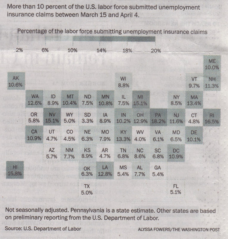 |
Blog sharing news about geography, philosophy, world affairs, and outside-the-box learning
Archives
December 2023
Categories
All
|
 RSS Feed