|
The cities and towns shown with a green dot on this map derive at least 10% of their revenue from traffic fines and related court fees. In many locales, the ratio is much higher, as in the two circled towns, Valley Brook, OK, and Henderson, LA. (Map from www.nytimes.com/2021/10/31/us/police-ticket-quotas-money-funding.html)
0 Comments
As it is for real-world leaders, one of the most challenging things for students in my "Mission Possible: Global Issues, Leadership Choices" class is learning how to manage the economies of their imaginary countries. In China, hidden borrowing by local governments now totals more than half of China's GDP and exceeds the amount of official, on-the-books debt, according to a recent estimate by Goldman Sachs. www.bloomberg.com/news/articles/2021-09-29/china-hidden-local-government-debt-is-half-of-gdp-goldman-says
Argentina recently released data showing that more than 40% of the country's population is living in poverty, with nearly 11% of the population classified as destitute (extreme poverty). The country had been in recession since 2018 and coronavirus-related shutdowns caused Argentina's GDP to sink an additional 9.9% from spring 2020 to spring 2021, devastating the country's middle class and youth. Income inequality has long had clear geographic patterns in Argentina, with the highest rates of poverty in the north and the lowest rates in and around Buenos Aires. www.reddit.com/r/MapPorn/comments/klpiuh/persistent_poverty_rates_in_argentina_by/
Although COVID infections seem to again be tailing off in the U.S., they are still raging in countries like Vietnam, which is not only a major U.S. trading partner -- particularly for electronics, furniture, machinery, footwear, and textiles -- but also a key node in global supply chains more broadly. This map shows which industries are focused where in Vietnam: www.vietnam-briefing.com/news/wp-content/uploads/2014/06/MapVietnamSourcing.png
After a rocky summer, bitcoin is again back above $50,000. This map is based on Chainalysis's Global Crypto Adoption Index, which attempts to measure cryptocurrency use by "ordinary people" in 154 countries around the world, adjusting for both population internet use and purchasing power parity. By this metric, Vietnam has by far the highest levels of crypto use. www.cnbc.com/2021/08/18/new-cryptocurrency-bitcoin-user-global-map.html
Happy Labor Day! This topological map shows union membership rates, by state, in 2020. www.statista.com/chart/17146/union-membership-rates-by-us-state
And therein lies the rub: just days after the UN Intergovernmental Panel on Climate Change releases its bleak report on global warming, the Biden White House asks the OPEC+ group to pump more oil to bring down gasoline prices, which are at or near a seven-year high. OPEC+ refers to the official members of the Organization of Petroleum Exporting Countries, shown in dark blue on this map, and other major petroleum producers who often coordinate with OPEC but are not members of OPEC, shown in light blue on this map. www.insightsonindia.com/wp-content/uploads/2020/03/Break_through.png
Although domestic tourism might be rebounding, the slow pace of vaccination in much of the world is expected to continue to depress international tourism. In fact, a recent UN report expects 2021 to be nearly as bad as 2020 in this regard, with estimates that global tourism will not return to pre-pandemic levels until 2023 or later. This geo-graphic shows the 10 countries that are expected to take the biggest hits to their economies in 2021 because of the lack of tourism. www.statista.com/chart/25202/gdp-losses-by-country-due-to-a-pandemic-related-reduction-in-tourism
On the one hand, the number of Chinese millionaires increased by 22% between 2019 and 2020 according to Credit Suisse. But according to an AfrAsia Bank report, China also lost more millionaires than any other country in 2019, with 16,000 high net worth individuals (defined as having assets of $1-10 million) emigrating from China that year. Turkey, however, saw the greatest proportion of its high net worth individuals leave in 2019 (8%). Where did they go? Australia was the top destination for HNWIs in 2019, followed by the U.S. www.statista.com/chart/25007/hnwi-emigration-by-country
If you explored the debt payment suspension map I posted on May 27, you may have noticed China is holding a lot of debt in the developing world. But China is also facing a major default crisis at home: "Even by the standards of a record-breaking global credit binge, China’s corporate bond tab stands out: $1.3 trillion of domestic debt payable in the next 12 months. That’s 30% more than what U.S. companies owe ... [and] it’s all coming due at a time when Chinese borrowers are defaulting on onshore debt at an unprecedented pace. ... The country’s onshore defaults have swelled from negligible levels in 2016 to exceed 100 billion yuan ($15.5 billion) for four straight years. That milestone was reached again last month, putting defaults on track for another record annual high." www.bloomberg.com/news/articles/2021-05-23/china-braces-for-1-3-trillion-maturity-wall-as-defaults-surge
Demographically, at least, Africa is the continent of the future. Will the money follow? This map shows where venture capital (VC) investment is flowing into Africa. (Interestingly, many startups that raise money in Nigeria, Africa's biggest economy and top VC market, are not incorporated in Nigeria. The same is not true for Kenya, the 2nd biggest VC market in Africa.) www.statista.com/chart/24911/vc-investment-by-country-in-africa
Under the World Bank and International Monetary Fund's Debt Service Suspension Initiative, 73 of the world's poorest countries have been eligible to suspend payments on external debt through Dec. 2021 in order to "concentrate their resources on fighting the pandemic and safeguarding the lives and livelihoods of millions of the most vulnerable people." This interactive map from HowMuch.net allows users to see which countries (in pink) have taken advantage of the DSSI program and, perhaps more interesting, which other countries hold that debt (in blue after clicking on a pink country). howmuch.net/articles/the-state-of-external-debt
This geo-graphic shows where the last year's urban shuffle, among other things, has driven down prices on the cost to rent a one-bedroom apartment in the U.S.: www.statista.com/chart/24826/change-in-rental-price-for-one-bedroom-apartment
According to the UN Environment Programme, the world wastes nearly a billion tonnes of food per year. This geo-graphic shows both the quantity of food waste in absolute terms in selected countries (orange bars) and the quantity of food waste per capita (in yellow circles). The reasons for food waste vary with the country; in poorer countries, waste may result from inefficiencies in field-to-table logistics, for example, whereas in wealthier countries more of the waste may be generated by the food service industry. www.statista.com/chart/24350/total-annual-household-waste-produced-in-selected-countries
A recent study finds that western Europe is falling behind eastern Europe in knowledge-sector jobs, both in terms of relative growth and in some cases in absolute numbers. Lower labor costs and a well-educated young workforce in eastern Europe are contributing to the eastward movement of knowledge-intensive industries, defined in the study as "the tech sector, information and communications technology, advanced services, and creative professions." Bratislava, Slovakia, has the continent's highest percentage of "brain jobs," with 22% of the working-age population employed in these industries. foreignpolicy.com/2021/04/02/it-is-western-europes-turn-for-a-brain-drain
A recent assessment by the World Bank and International Monetary Fund finds that the combination of debt, exacerbated by the coronavirus pandemic, and climate change may push a growing number of countries to the brink -- and, with them, the global economy if action is not taken.
"Take Belize, Fiji and Mozambique. Vastly different countries, they are among dozens of nations at the crossroads of two mounting global crises that are drawing the attention of international financial institutions: climate change and debt. ... One of the countries at the crossroads of the climate and debt crises is Belize, a middle-income country on the Caribbean coast of Central America. Its foreign debt had been steadily rising for the last few years. It was also feeling some of the most acute effects of climate change: sea level rise, bleached corals, coastal erosion. The pandemic dried up tourism, a mainstay of its economy. Then, after two hurricanes, Eta and Iota, hit neighboring Guatemala, floods swept away farms and roads downstream in Belize. Today, the debt that Belize owes its foreign creditors is equal to 85 percent of its entire national economy. The private credit ratings agency Standard & Poor’s has downgraded its creditworthiness, making it tougher to get loans on the private market. The International Monetary Fund calls its debt levels 'unsustainable.' ... Both the World Bank and the International Monetary Fund are important lenders, but so are rich countries, as well as private banks and bondholders. The global financial system would face a huge problem if countries faced with shrinking economies defaulted on their debts. ... "And then there’s Mozambique. The sixth-poorest country in the world. It was already sinking under huge debts, including secret loans that the government had not disclosed, when, in 2019, came back-to-back cyclones. They killed 1,000 people and left physical damages costing more than $870 million. Mozambique took on more loans to cope. Then came the pandemic. The I.M.F. says the country is in debt distress. Six countries on the continent are in debt distress, and many more have seen their credit ratings downgraded by private ratings agencies. In March, finance ministers from across Africa said that many of their countries had spent a sizable chunk of their budgets already to deal with extreme weather events like droughts and floods, and some countries were spending a tenth of their budgets on climate adaptation efforts. 'Our fiscal buffers are now truly depleted,' they wrote. In developing countries, the share of government revenues that go into paying foreign debts nearly tripled to 17.4 percent between 2011 and 2020, an analysis by Eurodad, a debt relief advocacy group found." www.nytimes.com/2021/04/07/climate/debt-climate-change.html How much house will half a million dollars buy you? This topological map from HowMuch.net shows the average square footage $500K will buy you by state: howmuch.net/articles/how-many-sqft-you-can-buy-500k
A recent report by Bloomberg Businessweek finds that more than 90% of the 2,600 U.S. counties studied charged owners of the least expensive homes relatively more in residential property taxes than the owners of the most expensive homes, based on the ratio of assessed value to market value. In some areas (shown in red on this map) the owners in the bottom decile of property values paid more than twice what the owners in the top decile of property values paid when adjusted for market value. (Map from www.bloomberg.com/news/features/2021-03-09/racial-inequality-broken-property-tax-system-blocks-black-wealth-building.)
In the U.S., lack of access to running water has tended to be associated with rural areas. But, as this geo-graphic based on a report prepared by the National Academy of Sciences shows, water insecurity in the U.S. is primarily an urban problem, with 73% of households that lack hot and cold running water located in cities, the majority of these being renters and people of color. cdn.statcdn.com/Infographic/images/normal/23731.jpeg
The maps accompanying this article from The Wall Street Journal show the impact of the pandemic on air travel by comparing domestic and international air traffic in the U.S. and around the world on Feb. 26, 2021 with that of Feb. 28, 2020. www.wsj.com/articles/the-places-you-cant-fly-to-anymore-11616248802
This geo-graphic looks at extreme poverty around the world (measured as living on $1.90 per day or less). If one can believe the numbers, it is worth noting that China's extreme poverty rate is now the same as that of the U.S., Japan, Canada, and Norway, among others. The size of the circle in each band reflects the number of people in extreme poverty. howmuch.net/articles/extreme-poverty-around-world
This article from The Wall Street Journal looks at how a year of remote work for 50% of the workforce has changed where we live:
"This rapid reordering accelerates a trend that has been under way for years. And it doesn’t just change the dynamic between workers and companies. It is affecting the economic fates of cities and communities large and small, but especially smaller ones: They can now develop and build their economies based on remote workers and compete with the big-city business centers and West Coast high-tech meccas that have long dominated the employment landscape. Smaller metro areas such as Miami, Austin, Charlotte, Nashville and Denver enjoy a price advantage over more expensive cities like New York and San Francisco, and they are using it to attract newly mobile professionals. Smaller cities like Gilbert, Ariz., Boulder, Colo., Bentonville, Ark., and Tulsa, Okla., have joined the competition as well, some of them launching initiatives specifically designed to appeal to remote workers. And more rural communities including Bozeman, Mont., Jackson Hole, Wyo., Truckee, Calif., and New York’s Hudson Valley are becoming the nation’s new 'Zoom towns,' seeing their fortunes rise from the influx of new residents whose work relies on such digital tools. ... Such changes may begin to reverse the increasingly winner-take-all nature of America’s economic geography. In the decade and a half leading up to the Covid-19 pandemic, more than 90% of employment growth in America’s innovation economy was concentrated in just five coastal metro areas: San Francisco, San Jose, Seattle, San Diego and Boston, according to the Brookings Institution. ... For cities, remote work changes the focus from luring companies with special deals to luring talent with services and amenities. Communities can invest precious tax dollars more wisely and cost-effectively on things like better schools and public services, parks and green spaces, safer streets, bike lanes and walkable neighborhoods. ... "Over time, the competition for talent could shift to places that offer the best combination of quality of life, affordability and state-of-the-art ecosystems to support remote work. Before the pandemic, a number of communities developed strategic initiatives to attract newcomers—some aimed at high-tech workers but others open to anyone who commits to moving. Many include the lure of cash incentives, akin to the moving expenses paid by companies to new hires. The programs’ perks and requirements vary. 'Remote Tucson' offers $1,500 in cash and employment help for spouses; Hamilton, Ohio, covers up to $300 a month in student loans for nearly three years for recent graduates in science, math and tech fields; Savannah, Ga., reimburses $2,000 in moving expenses for new arrivals with three years’ experience in tech fields. 'Tulsa Remote,' established three years ago, pays remote workers who move from outside the city $10,000, plus access to affordable housing. (The costs are underwritten not by city hall but by a foundation.) ... To lure and support the growing ranks of remote workers, communities will need to build out more complete ecosystems for them to live, work and gather. First and foremost, that means ensuring adequate broadband connectivity. As the pandemic fades and people venture back outside, it will also mean ensuring the availability of abundant co-working spaces and “third spaces” such as cafes and restaurants, where remote workers can mingle and meet, and outdoor recreational spaces where they can go to recharge their mental batteries." www.wsj.com/articles/how-remote-work-is-reshaping-americas-urban-geography-11614960100 Last March saw a sharp rise in unemployment throughout much of the U.S. This map looks at the highest (in dark red) and lowest (in pink) unemployment rates across the 389 metropolitan areas of the U.S. as of December 2020. howmuch.net/articles/us-unemployment-rates-metropolitan-area
Earlier this week, the U.S. Department of Commerce finalized its study of unfair trading practices on flat-rolled sheet aluminum imported from 18 countries (shown in aluminum-gray on this map :-)). New tariffs range from to 2.7% on Greek flat-rolled sheet aluminum to 243% on German sheet aluminum. (These come on top of the 10% aluminum tariffs imposed by the Trump administration, citing national security.) www.reuters.com/article/us-usa-trade-aluminum/u-s-commerce-sets-anti-dumping-duties-on-aluminum-sheet-from-18-countries-idUSKCN2AU2S4?il=0 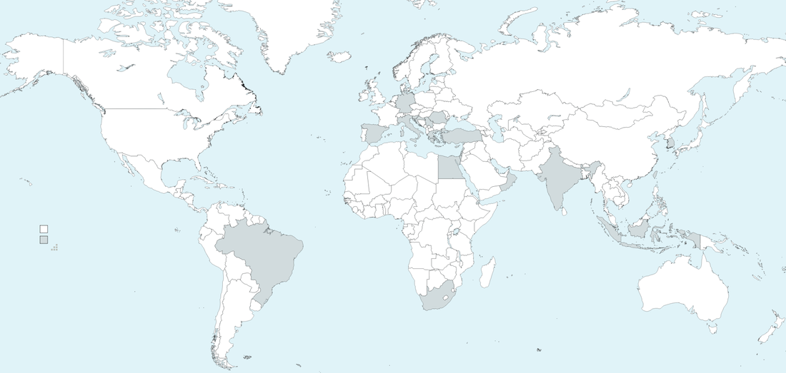 The federal minimum wage, which is $7.25 per hour, has not increased in 11.5 years (during which inflation has eroded purchasing power by 24%). All of the states shown in a color other than red on this topological map have a state minimum wage higher than the federal minimum wage. www.statista.com/chart/17169/state-minimum-wages-united-states
|
Blog sharing news about geography, philosophy, world affairs, and outside-the-box learning
Archives
December 2023
Categories
All
|
 RSS Feed