|
In this image, the map of the world has been redone as a Voronoi diagram based on distance to the nearest capital. preview.redd.it/k6x3plgwpyz21.png?width=960&crop=smart&auto=webp&s=f89a3b8b46990d12038592c7b340955da55e4cfe
0 Comments
After the recent visit of Egyptian President Sisi, the Trump Administration is looking into declaring the Muslim Brotherhood a terrorist organization. However, in addition to having been the best-organized political opposition in Egypt prior to being banned by Sisi's government in 2013, the Muslim Brotherhood is a diverse organization operating in many countries and having a variety of political and social goals. This map, from Al Monitor, shows the status of the Muslim Brotherhood in the Middle East. www.al-monitor.com/pulse/originals/2019/05/trump-allies-push-back-muslim-brotherhood-terror.html
At least 10% (and in one case more than a quarter) of voters in eight states (in dark green) cast their ballots for someone other than Hillary Clinton or Donald Trump in the presidential election of 2016. In the four states shown in red, by contrast, more than 96% of voters hewed to the two-party line. brilliantmaps.com/not-hillary-trump/#more-3964
Transparency International recently released its new (2018) Corruption Perceptions Index data. The people of Denmark and New Zealand continue to perceive their countries as having the "cleanest" governments. The U.S. dropped four points, out of the top 20 "clean" countries, surpassed by Estonia and France. Brazil and Mexico continue to fall, and China's high-profile "anti-corruption" campaign does not seem to be having the desired effect. The people of Somalia, Syria, and South Sudan continue to experience their countries as the most corrupt. www.transparency.org/cpi2018
Earlier this week, Turkey demanded that Google remove a map of Greater Kurdistan. Google complied. The original map can be seen here in this article from a Turkish newspaper: www.hurriyetdailynews.com/turkey-demands-google-to-remove-kurdistan-map-minister-139999 (Wikipedia continues to include maps of Greater Kurdistan in its entry on Kurdistan.)
Election day is here. At the very least, that means the end to nonstop political ads. How do the ads in your area compare to ads shown in other parts of the country? This series of maps is based on an analysis of more than 3 million 2018 political ads. www.bloomberg.com/graphics/2018-what-the-midterm-campaign-looks-like-in-your-hometown
One of the open questions in the Brexit negotiations between the United Kingdom and the European Union has been the flow of people and goods between the Republic of Ireland (which is part of the EU) and Northern Ireland (which is part of the UK). The undulating 310-mile border between Ireland and Northern Ireland includes the 195 public road border crossings shown in red on this map, more than exist between the U.S. and Canada. brilliantmaps.com/border-crossings-ireland/#more-3794 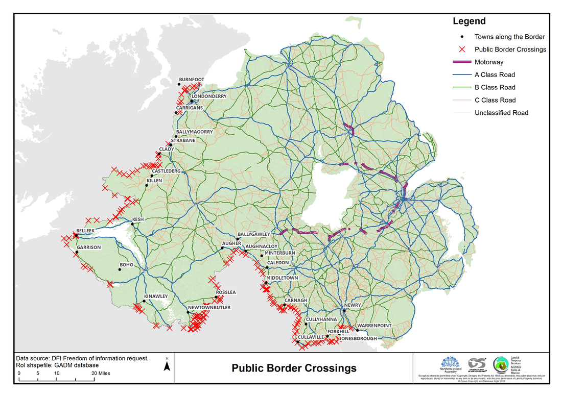 As U.S. midterm electioneering heats up, this map becomes particularly interesting to political geographers. The counties in purple voted for Barack Obama in 2008 and Donald Trump in 2016. www.reddit.com/r/MapPorn/comments/8hpcde/counties_where_the_majority_of_the_voters_chose/
Reporters Without Borders' annual World Press Freedom Index finds that, globally, journalism and journalists are under increased attack. In 2018, only 26% of countries scored "good" (light yellow on the map) or "fairly good" (dark yellow on the map) in terms of press freedom, down from 27.2% in 2017 and 29.5% in 2016. So far in 2018, 35 journalists have been killed and another 168 are sitting in prisons.
From the report, "Hostility towards the media from political leaders is no longer limited to authoritarian countries such as Turkey (down two at 157th) and Egypt (161st), where 'media-phobia' is now so pronounced that journalists are routinely accused of terrorism and all those who don’t offer loyalty are arbitrarily imprisoned. More and more democratically-elected leaders no longer see the media as part of democracy’s essential underpinning, but as an adversary to which they openly display their aversion. The United States, the country of the First Amendment, has fallen again in the Index under Donald Trump, this time two places to 45th. A media-bashing enthusiast, Trump has referred to reporters 'enemies of the people,' the term once used by Joseph Stalin. The line separating verbal violence from physical violence is dissolving. In the Philippines (down six at 133rd), President Rodrigo Duterte not only constantly insults reporters but has also warned them that they 'are not exempted from assassination.' In India (down two at 138th), hate speech targeting journalists is shared and amplified on social networks, often by troll armies in Prime Minister Narendra Modi’s pay. In each of these countries, at least four journalists were gunned down in cold blood in the space of a year. Verbal violence from politicians against the media is also on the rise in Europe, although it is the region that respects press freedom most. In the Czech Republic (down 11 at 34th), President Milos Zeman turned up at a press conference with a fake Kalashnikov inscribed with the words 'for journalists.' In Slovakia, (down 10 at 27th), then Prime Minister Robert Fico called journalists 'filthy anti-Slovak prostitutes' and 'idiotic hyenas.' A Slovak reporter, Ján Kuciak, was shot dead in his home in February 2018, just four months after another European journalist, Daphne Caruana Galizia, was killed by a targeted car-bombing in Malta (down 18 at 65th)." For the full report, see rsf.org/en/rsf-index-2018-hatred-journalism-threatens-democracies Last week, the U.S. opened its controversial new embassy in Jerusalem. Eighty-six countries with diplomatic missions in Israel received invitations to attend. This map shows which countries decided to send representatives to mark the occasion. infographic.statista.com/normal/chartoftheday_13851_who_attended_the_us_embassy_opening_in_jerusalem_n.jpg
Dotting the Pacific Ocean are dozens of islands, some independent, some joined in federation, and many administered by larger countries. This map illustrates the complex political geography of the Pacific and Oceania. upload.wikimedia.org/wikipedia/commons/8/8d/Oceania_Political_Map_%28EEZ_based%29.png 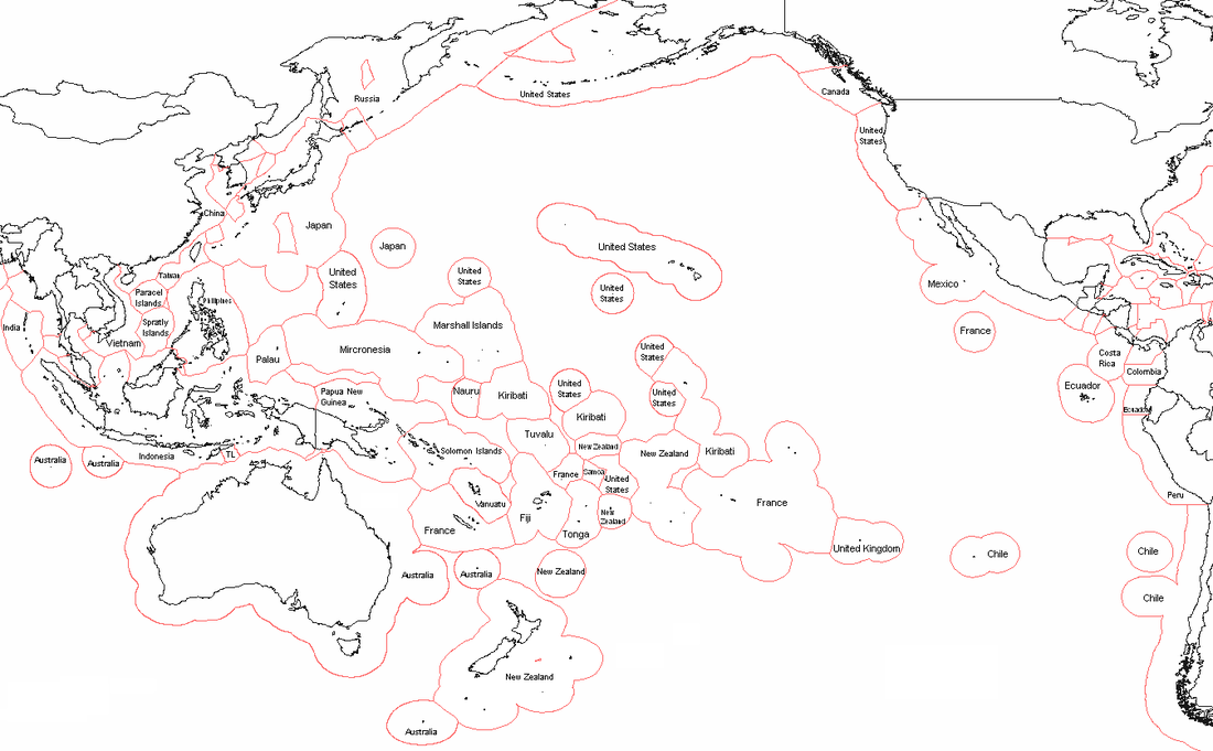 This map compares when women got the right to vote in a given country. (The asterisks suggest that a woman's right to vote came in stages in that country; for example, some states/provinces may have allowed women to vote earlier than the national law or the national law initially applied only to women who met certain age/property requirements and full suffrage came later.) i.redd.it/jmwkxomstiq01.jpg
This article from Geographical magazine (UK) examines the issues behind the "Macedonia" naming dispute that has soured relations between Greece, the former Yugoslavian People's Republic of Macedonia, and Bulgaria: Who is Macedonia? Where is Macedonia? What was Macedonia? Why does it matter? geographical.co.uk/geopolitics/hotspot/item/2674-hotspot-greece-and-macedonia
This interactive map gauges the economic and political risks of doing business in various countries around the world. www.marsh.com/content/marsh/political-risk-map-d3/prm-2018.html
This map compares when slavery was formally abolished in the Western Hemisphere. (Because of colonization patterns, not everything lines up neatly with contemporary nation-state borders.) hillfighter.deviantart.com/art/Abolition-of-Slavery-Americas-215869460
Soft power -- one of the metrics students in my "Mission Possible: Global Issues, Leadership Choices" class come to understand firsthand -- is the power to get other people to do what you want because they like, admire, trust, and respect you (as opposed to the coercive force of hard power). This map, based on opinion surveys of European Union residents, hints at shifts in American soft power resources.
www.reddit.com/r/MapPorn/comments/7qrb1w/changing_views_of_the_united_states_in_the_eu/ Google tracks search terms and can aggregate search data by state. These two maps compare where residents searched for "gun shops" vs. "gun control" more frequently. The map on the left is from the last week of February (i.e., after the Florida high school shooting). The map on the right is from the previous year. www.businessinsider.com/gun-control-gun-shop-map-2018-3 Transparency International, an NGO that fights corruption by shining a bright light on it, has released its latest Corruption Perceptions Index. Among countries now seen by their residents as having become more corrupt over the last few years: Hungary, Spain, Madagascar, Turkey, El Salvador, Australia, Liberia, and Bahrain. Countries seen as moving towards less corruption include Estonia, Greece, Senegal, Costa Rica, Belarus, Cote d'Ivoire, Latvia, and the Czech Republic. For the full report, see www.transparency.org/news/feature/corruption_perceptions_index_2017.
This map shows which countries are still lacking a U.S. ambassador (current as of February 22). The majority of these vacancies do not even have an ambassadorial nominee. www.statista.com/chart/12990/these-countries-still-dont-have-a-us-ambassador/
This map reveals one of the lesser-known stories of African politics: movement towards less authoritarian governments over the last 30 years. ("Anocracy" is a term from political science and human geography that refers to a blend of democracy and authoritarianism.) i.redditmedia.com/kiSNwvnU1px5h9o-A-SgvQYFiueSHbObtlCjfkQQY6o.png?w=1024&s=addac291648a93926051c0a739d6fc59
"[C]an someone's geographical location play a part in whether they will join a hate group? According to a group of University of Utah geographers whose research was published in the Annals of the American Association of Geographers on Friday, the answer is yes. 'Hate is a geographic problem. The ways people hate are based on the cultures, histories, ethnicities and many other factors dependent on place and place perception,' the geographers said in a news release." www.deseretnews.com/article/900010002/geography-of-hate-u-study-examines-hate-groups-based-on-region.html
The Economist (UK) produces an annual Democracy Index, which has documented, in part, the retreat of global democracy since 2008. This map is the result of the newest Democracy Index. Click on the link to see country-specific information. www.economist.com/blogs/graphicdetail/2018/01/daily-chart-21
The efforts of Catalonia to separate from the rest of Spain continue to make headlines, but Spain's headache is one many other European countries share. This map looks at separatist movements across Europe, and the accompanying article from The Guardian (UK) provides information on each one:
www.theguardian.com/world/ng-interactive/2017/oct/27/beyond-catalonia-pro-independence-movements-in-europe-map The Institute for Economics & Peace has released its 2017 Global Terrorism Index. The good news: deaths due to terrorism dropped 13% globally between 2015 and 2016, including declines in Afghanistan, Nigeria, Pakistan, and Syria (which together, along with Iraq, accounted for 3/4 of all terrorism-related deaths). The bad news: more countries than ever before (77) reported at least one death due to terrorism in 2016, terrorist attacks against civilians were up 17% on the year, and certain countries have seen significant increases in terrorism-related deaths (a single-year increase of 40% in Iraq, an 8-fold increase in Egypt since 2002, a 16-fold increase in Turkey since 2002). The chart below shows the 10 most fatal terrorist attacks in 2016. For the full report, see visionofhumanity.org/app/uploads/2017/11/Global-Terrorism-Index-2017.pdf
This map is based on data from Latinobarómetro, an opinion poll conducted in 18 Latin American countries annually. i.imgur.com/wDWqFq3.png
|
Blog sharing news about geography, philosophy, world affairs, and outside-the-box learning
Archives
December 2023
Categories
All
|
 RSS Feed