|
In many countries around the world, remittances, the money sent home by workers abroad, is a significant contributor to local and national economies. This geo-graphic, based on World Bank data, shows which countries received the most money in remittances in 2018:
www.statista.com/chart/20166/top-10-remittance-receiving-countries/
0 Comments
This interactive site, courtesy of a UK university, maps food security deaths by year: chaosmap.gitlab.io/2017
In most (but not all) parts of the U.S., the clocks change this weekend when daylight savings time ends. In other parts of the world, the clocks have already changed or do not change at all. (And, of course, the direction clocks change may be different in the northern and southern hemispheres.) This map looks at which countries, and parts of countries, use daylight savings time: i.pinimg.com/originals/36/f7/67/36f767836c680cdccc511b00a0514c6e.gif
My "10 Weeks in Asia" class is studying Indonesia this week, and I came across this map that underscores the population (and population density) of the Indonesian island of Java (shown in orange): www.wowshack.com/wp-content/uploads/2017/09/JavaCountries.jpg
During the last ice age, global geography would have appeared quite different, with extensive land and sea ice lowering ocean levels significantly. This Reddit map tries to recreate global geography as it would have existed 21,000 years ago. Although the ice coverage is eye catching, a careful look at southeast Asia, western Asia, and Oceania, for example, shows the way a drop in sea level changed the geography of these regions dramatically, a history that still echoes in their biogeography. i.redd.it/drvhvjbtw3b31.jpg
The National Oceanic and Atmospheric Administration (NOAA) developed the Science on a Sphere projection software for interactive 3D museum displays in 2004. Now, NOAA has released a free app to bring the same information, drawn from 140+ datasets and including real-time information, to bring geographic animations to the small screen. Users can track storms, monitor ocean temperature, check cropland, watch air traffic, map earthquakes, and much, much more. SOS Explorer or SOSx is available for iOS and Android. sos.noaa.gov/sos-explorer/about-sos-explorer/
For those accustomed to looking at some variant of the standard Mercator projection map (with the equator in the middle, the Americas to the left and Europe, Africa, Asia, and Australia to the right), this "vertical world map" from China will look radically different, with an emphasis on the Arctic and Asia. bigthink.com/strange-maps/future-world-map
This amusing world map was posted by a Reddit user :-). i.redd.it/wt5oe5z23pe31.jpg
Under international law, a stateless person is a person who does not possess nationality of any state. Often, this occurs because a given group is denied citizenship, as in the case of the Rohingya in Myanmar or the Burkinabé in the Côte d’Ivoire. Other times, it occurs because of border disputes, war that disrupts documentation, or because citizenship is passed patrilineally in a given country and patrimony cannot be proved. Being stateless generally means an individual lacks the paperwork to legally travel, work, access health care, marry, or open a bank account. As of 2018, the UN recorded nearly 3 million stateless persons. (This number does not include stateless persons who have registered as refugees in another country, as more than 1 million Rohingya have in Bangladesh.) This map shows the geographic distribution of stateless persons. (from popstats.unhcr.org/en/overview) 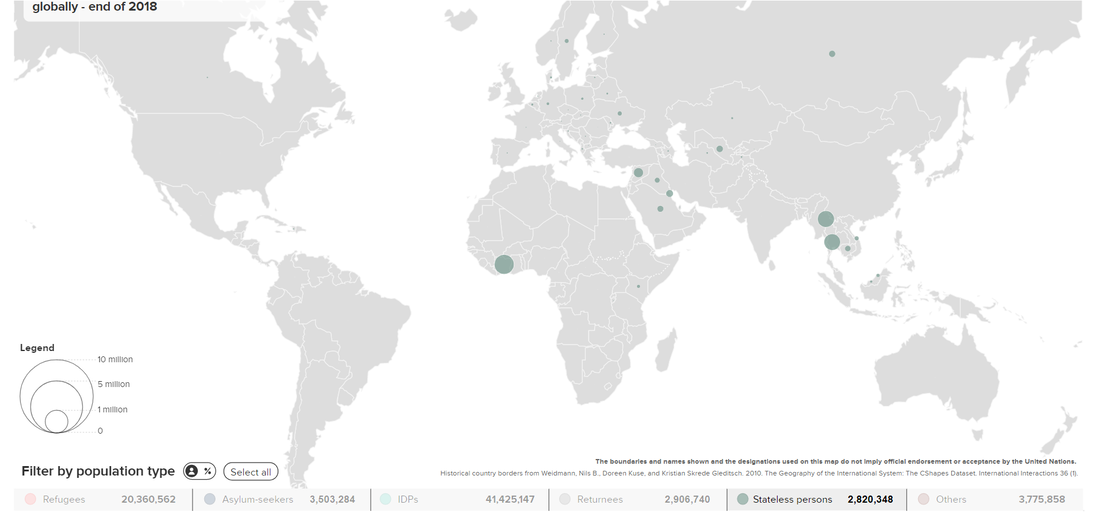 In 1979, 10 years after the first moon landing, the United Nations adopted the "Agreement Governing the Activities of States on the Moon and Other Celestial Bodies," also known as the Moon Treaty. The treaty was designed to prohibit the militarization, commercialization, and colonization of bodies in our solar system, including the moon, without the consent of the international community. This map looks at the handful of states that are parties to the treaty (in green) or that have signed the treaty but are not necessarily bound by it (in blue). www.statista.com/chart/18738/countries-that-are-signatories-or-parties-to-the-1979-moon-treaty/
Because today is 7-11, I thought it would be interesting to share this geo-graphic showing the global distribution of the 7 Eleven convenience store chain's 68,000+ locations. (Did you know there are more 7 Elevens in Japan than in any other country?) www.statista.com/statistics/269454/number-of-7-eleven-stores-worldwide-in-2010-by-country/
The Pew Research Center is one of the most well-respected names in demographic research, including religious demography. This series of maps shows in which country or countries at least 50% of adherents of a given religion live. www.pewresearch.org/wp-content/uploads/2014/08/FT_Religions_Big.png (From https://www.pewresearch.org/fact-tank/2014/08/27/many-religions-heavily-concentrated-in-one-or-two-countries/)
Here's a thematic map one doesn't see every day: this map shows which parts of the world historically used elephants in battle.
www.reddit.com/r/MapPorn/comments/c6ifji/historical_range_of_the_use_of_war_elephants/ Much of the eastern and central U.S. has been struggling through an excessively wet spring, to the point that many farmers still have not been able to plant their crops. It is easy to forget that this experience is not the norm, though. This map looks at precipitation patterns globally over the last two years. The areas in dark red -- which include most of Australia and Western Europe, much of northern South America, parts of India, Canada, and the western U.S., and much of southern Africa, the Sahel, and the Horn of Africa -- have experienced significantly below-average precipitation through the two years ending in May. You can play with the parameters of the data to see where drought is evident or imminent: spei.csic.es/map/maps.html 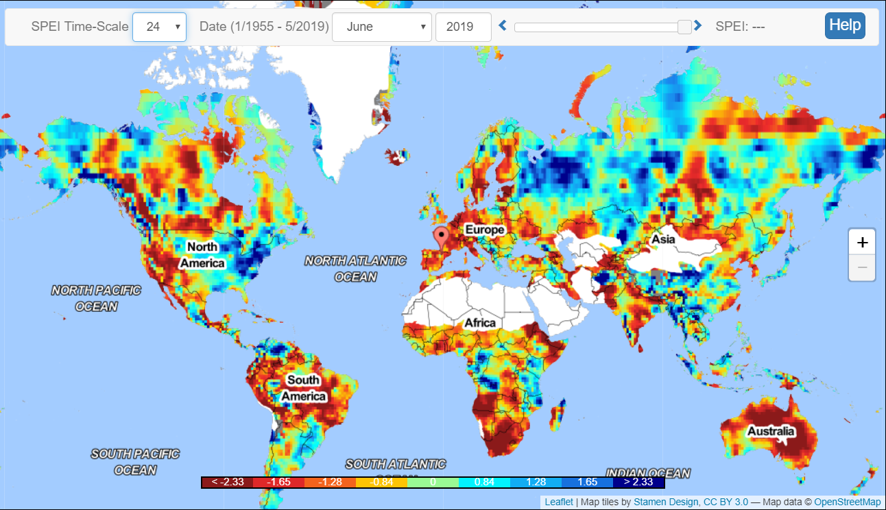 A cartogram is a map that has been weighted for a particular variable. In this case, the variable is the number of times Donald Trump mentioned the country in a tweet since being elected U.S. president (through May 2019). worldmapper.org/maps/politics-trumptweets-2016to2019/
In this image, the map of the world has been redone as a Voronoi diagram based on distance to the nearest capital. preview.redd.it/k6x3plgwpyz21.png?width=960&crop=smart&auto=webp&s=f89a3b8b46990d12038592c7b340955da55e4cfe
Understanding the geographic range of vectors helps scientists and public health officials forecast disease outbreaks. These maps were developed by analyzing the ranges of not only the mosquitoes and ticks that spread the arboviruses being studied but also potential mammalian and avian hosts. Among other things, the model turned up high risks for potential outbreaks of Zika in South Asia and of Japanese encephalitis in Europe. geographical.co.uk/people/development/item/3106-zika-dengue-and-yellow-fever
These maps compare child mortality -- defined as the percentage of children who are born alive but die before their 5th birthday -- across time. In 1800, an estimated one-third to one-half of all children born globally before their 5th birthday. By 2015, child mortality rates are vastly lower and clearly linked to economic development. ourworldindata.org/uploads/2018/10/3-World-Maps-of-Child-Mortality-Rate.png
In January, a tailings dam associated with an iron mine in Brazil collapsed. The resulting flood of mining waste killed more than 200 people. There are an estimated 3,500 tailings dams worldwide, with 42 dam failures recorded between 2008 and 2017. This map shows the countries with the most tailings dam failures in recent history and the amounts of mine waste released: geographical.co.uk/places/mapping/item/3145-tailings-dam-cartograms
This map shows the world's landlocked countries. Several of these countries, including Ethiopia, the world's most populous landlocked country, became landlocked as the result of border changes (typically following from war or collapse of empire) that left them without access to the sea. worldpopulationreview.com/countries/landlocked-countries/
Population growth, climate change, and outdated policy are exacerbating water problems around the world, especially in those areas dependent on aquifers. This map, from The Economist (UK), shows (in mauve) where water stresses are likely to be especially acute by 2040: www.economist.com/sites/default/files/imagecache/800-width/images/print-edition/20190302_SRM930_2.png
Good to know if you're traveling: where can you drink the tap water? cdn.24.co.za/files/Cms/General/d/6898/42bee9b6787f4bfa8db28aa945856013.jpg
As students in my "Hands-On Geography" classes know, even physical geography is subject to change over time. This interactive mapping tool allows users to see how any given address has changed position over the last 750 million years: dinosaurpictures.org/ancient-earth#0
The winners of the Wikimedia Foundation's "Wiki Loves Earth" photo contest are not just visually stunning, they provide unexpected insights into global geography: wikimediafoundation.org/2018/12/17/lose-yourself-in-our-planets-beauty-with-the-winners-of-wiki-loves-earth/
The blue part and the red part of this Reddit map both show 5% of the world's population! i.redd.it/bvik564g0sa21.jpg
|
Blog sharing news about geography, philosophy, world affairs, and outside-the-box learning
Archives
December 2023
Categories
All
|
 RSS Feed